
In the last post , we finished our first user story. That user story was pretty simple, but it flushed out the design of our home page. The next user story, As an administrator, I want to invite users to Loccasions is not quite so simple. The implications from this user story are big: First, we have a new role, administrator, which brings our roles to two (unregistered user and administrator).
Read the original post:
RubySource: Rails Deep Dive: Loccasions, Authentication
via Comments on:
Part of the appeal of mobile services is that they are relevant to where you are right now. Most phones support GPS and a connection to the network. And when you combine those you get a convenient location based service. In this example application we are going to create a backend service in PHP that an iPad application on the front end will connect to
Read More:
BuildMobile: Building a GPS Enabled iPad Search App
via Comments on:
Digging around the web will unearth a heavy bias against the fold. “A rule of thumb that kills innovation.” “Used by people who don’t know what they’re talking about.” “A concept introduced by someone who is a moron.” “The fold is bogus.” “The fold is a myth.” “The fold is a silly thing that clients like to focus on.” “There is no fold.” There is even a web site called thereisnofold.com . This is not an issue that lacks for opinion. What is the fold and what do we know about it?
Read More:
DesignFestival: The Fold Exists but Does it Matter?
via Comments on:
You may have noticed the updated background on DesignFestival, currently, it is Winter Candy by Alex Walker. As mentioned earlier , we’ll be cycling through some of the backgrounds entered into the competition. Didn’t catch the contest? The Cicada Principle Explained Gallery of Entries Contribute to the Gallery Thanks again to all of the entrants for their great work, and we look forward to seeing more entries into the Gallery
Link:
DesignFestival: Cicada Principle — Winter Candy
via Comments on:
This is my last post in the Code Safari series here on Ruby Source. I have really enjoyed writing it and trying out a new format which I hope you have found useful. For my concluding article, I want to leave you with some tips for planning your own safari since that is really what the whole series has been about: Not your typical how-to, but a glimpse into the work flow that I and many other developers use everyday to figure out how our tools work. Here are five practices that you should incorporate in to your day-to-day craft
Read More:
RubySource: Code Safari: End of the Road
via Comments on:
Episode 120 of The SitePoint Podcast is now available! This week regular panel members Patrick O’Keefe (@ifroggy), Brad Williams (@williamsba) and Stephan Segraves (@ssegraves) are joined by SitePoint community member Ralph Mason (@pageaffairs) who is one of the contributors to Web Voices Of The Community.
Play this episode directly in your browser — just click the orange “play” button below:
You can download this episode as a standalone MP3 file. Here’s the link:
The SitePoint Podcast is on iTunes! Add the SitePoint Podcast to your iTunes player. Or, if you don’t use iTunes, you can subscribe to the feed directly.
Here are the topics covered in this episode:
Browse the full list of links referenced in the show at http://delicious.com/sitepointpodcast/120.
Transcript to follow
Theme music by Mike Mella.
Thanks for listening! Feel free to let us know how we’re doing, or to continue the discussion, using the comments field below.
via Comments on:
In a figurative sense, the concept of visual balance is similar to that of physical balance illustrated by a seesaw. Just as physical objects have weight, so do the elements of a layout. If the elements on either side of a layout are of equal weight, they balance one another. There are two main forms of visual balance: symmetrical and asymmetrical
Originally posted here:
DesignFestival: Balance in Design
via Comments on:
Waiting for Android: UrlJsonAsyncTask Source code for this article: UrlJsonAsyncTaskTest on GitHub Download and install the Android app: UrlJsonAsyncTaskTest.apk (Android 2.2 or greater) You can also scan this QR Code to download it to your Android phone: Overview I can’t even count how many times I’ve had to load a ProgressDialog in Android, query JSON from a remote URL, and then return control back to the app once the query has completed. It’s an incredibly common control flow, and one I’m sick of doing over and over again. I’m sure I’m not alone.
Read more here:
BuildMobile: Waiting for Android: UrlJsonAsyncTask
via Comments on:
As we move though the book, we’re going to meet some relatively complex code for recreating native effects and behaviors. Thanks to some (fairly) standard hooks and APIs, however, there are a few tricks we can employ to add a bit of pizzazz to our apps without having to do much work at all. 3.1. Nifty Links For security reasons, mobile web applications are sandboxed away from many built-in features of the mobile device; for example, unlike native apps, they’re not able to retrieve a list of a user’s contacts, or take a photo with the device’s camera (yet).
Read More:
BuildMobile: Mobile Web Apps: Quick Wins
via Comments on:
Welcome to episode nine. Today’s podcast is from Myles Eftos, one of the authors of the Sitepoint book, Build Mobile Websites and Apps for Smart Devices , and the Learnable course, Build Mobile: Develop websites and apps for smart devices . In this episode, Myles talks about designing for mobile platforms.
View original post here:
DesignFestival: Design Festival Podcast #9: Design for Mobile Apps and Websites
via Comments on:
We’ve looked at some of the broader considerations when designing for mobile, so now let’s address the business of our application. First, we need a plan. Our client has given us some high-level user scenarios, which we will need to examine in more detail to figure out what each means for our application. It’s crucial to decide precisely which features we intend to deliver, and to whom
More:
DesignFestival: Design for Mobile — Putting it Into Practice
via Comments on:
You may have noticed the updated background on DesignFestival, currently, it is Blind Date Prep by Alan Dowling . Over the next number of weeks we’ll be rotating the background through the most popular entries to further show off the hard work people applied in this contest. Didn’t catch the contest? The Cicada Principle Explained Gallery of Entries Contribute to the Gallery Thanks again to all of the entrants for their great work, and we look forward to seeing more entries into the Gallery
Original post:
DesignFestival: Celebrating The Cicada Principle
via Comments on:
At our interactive agency, we often have work that is either outside our core area of expertise or that we simply don’t have the resources to complete in the time required. We often look to outsource these projects to a few trusted contractors we have worked with often. Several times per month, we send a contract project to a copywriter, photographer, programmer or designer. We are always looking for good people to add to our list of resources for future projects.
We love having reliable contractors with various skill sets that we know do good work. Unfortunately many times just doesn’t work out. In fact, most contractors are never asked to do a second project. Dave Hecker, author of the SitePoint book Outsourcing Web Projects: 6 Steps to a Smarter Business once told me to find good, reliable contractors I’d have to try 5 or more that didn’t work out. Those aren’t very good odds! Even though we check portfolios, review sample code, and call references, the majority of contractors still don’t meet up to our standards.
What’s involved in working with an agency? Why do most projects end in failure? What can contractors and small companies do to successfully pitch an agency? And how can you make sure your project is a huge success so you’re hired again (and again)? Read on.
The right agency is a perfect client. Think of all the things that frustrate you about working with clients; they don’t understand how websites work, or they expect an Amazon.com for $500, or they want to be able to change text on a page one hundred times without having to pay any extra. These are non-issues when working with an agency.
Most agencies (especially interactive agencies) know how the industry works. They are willing to pay respectable rates for work, and understand that time is billed hourly and changes cost money.
The right agency will provide detailed information about each project, including budget, timeframe, technical specifications, and deliverables. They will happily answer any questions you have, and should be able to answer them easily.
Another, and perhaps the biggest benefit of working with agencies, is that they can send you a steady stream of work. We often have several projects at a time that we could outsource to programmers and developers, and we have no shortage of work in the pipeline.
Okay, so you’re interested in doing work for agencies… how can you make yourself stand out? We find contractors all sorts of places, but regardless of where we find them, we always look for the following at a minimum:
This is a bare minimum. We need to be able to check out a contractor to make sure they have the basics before moving on to the RFP stage. If we feel a contractor meets the minimum requirements, we will send them a request for proposal, with detailed information such as a technical specification, creative brief, or even a working mockup and ask for an estimate.
If everything looks good, we’ll often schedule a phone or Skype interview to discuss the particulars of the project, answer any questions, and see when we could get started.
This is where things often fall apart. Contractors always seem to do a great job during the courting phase, but once the project gets underway you really find out about their work ethic and skills. If you want repeat business, this is where you really need to shine.
The biggest issue we have during a project is lack of communication. We even have had contractors promise to give us daily updates, only to not hear from them for a week or two at a time. The key here is to be clear about when and how you will communicate, and follow through.
The second biggest issue we have is missed deadlines. Agencies have clients we are accountable to, so when we don’t hear from a contractor for weeks or deadlines get pushed back, we have to push back deadlines with our client, which makes us look bad. Putting me in a bad position with one of my clients is a sure-fire way to never get any more work from me. I understand emergencies happen, but communication is essential. If something comes up and you will not be able to make a deadline or milestone, let them know as soon as possible.
The last major issue we have is failure to meet the requirements we have provided. We provide detailed information on what we are looking for in a design, script, or copy. So often what we receive back from a contractor is missing a major requirement, such as a graphic in the wrong format or a script that doesn’t do one of the functions we requested. If you have a question about /any/ of the requirements, ask for clarification. It’s a good idea to setup a phone or Skype call to go over the requirements or brief before beginning. Ask a lot of questions, and make sure youfully understand exactly what is being asked.
In short, over-communicate, meet deadlines, and be absolutely sure you meet the requirements, and you will set yourself up to receive a lot of repeat business!
In my next issue, we’ll continue this discussion with tips on how to find agencies who are looking for contractors.
via Comments on:

Google wants Chrome to be a clean distraction-free browsing experience. They’re possibly about to take their most radical step yet. Interface minimalism will reach it’s ultimate zenith with the removal of the address bar.
Madness?
Perhaps. But Mozilla are considering the same UI move.
The idea has received an overwhelmingly negative response from technical users. However, before you reach for your soapbox, be aware that it’s only a proposal which may never see the light of day. If it does happen, it will almost certainly be an option and “compact view” might only be permitted on application tabs. When enabled, the user may have to double-click a tab to view the URL.
So why does Google think a 30-pixel gain is so important? It would provide an extra 5% of space on some tablet and netbook screens, but there are deeper reasons…
I use the address bar. You probably use it too. But many users don’t. Non-technical users rarely understand URLs; it’s plainly obvious when you observe them type www.whatever.com into Google’s search box. So why retain a feature few people use?
We should also consider how web use is changing. We know the browser is a separate application but it’s likely to evolve as operating system vendors attempt a more integrated approach. Icons, application tabs and pinned sites are just the start. The distinction between online and offline is already blurred and, within a few years, users won’t know or care where an application resides.
There’s also been a noticeable shift in internet marketing. While companies still promote their URL on advertising media, many now publish more memorable search keywords for Google or Facebook.
Finally, there are commercial incentives. Without the bar, users must resort to a search engine; they’ll aways see a page of results and revenue-paying adverts before reaching their destination.
But what about the drawbacks? If you can’t see the address bar, it’s more effort to enter a URL. If users really don’t want the bar, it can usually be hidden or they can switch to full-screen mode (F11 in most browsers).
Web developers also depend on the URL — especially when testing web applications or REST services. Removing the bar will make our lives more difficult.
Finally, without the address bar, it’s more difficult to ensure you’re on the correct site or check security settings. Those involved in phishing scams will be eagerly anticipating the UI change.
The idea makes me uncomfortable. Users may not understand URLs, but removing the bar won’t help them learn. I’m sure many car drivers don’t understand hydraulics but that’s not a reason to remove their brakes (OK — bad metaphor, but a web without URLs is not without danger).
I’m all for UI simplification, but this seems like a step too far. If it happens, Google should rename their browser: “Chrome-less” would be more apt.
What do you think? Should the address bar go? Could it be an option? Are the risks too great?
via Comments on:

You may have noticed the “Featured Image” box when editing a post or page. It allows you to upload or select an associated image for the article. It generally appears as a thumbnail when viewing a list of posts, perhaps in a category index or search results.
Thumbnail support must be enabled within your theme. You could add it to a plug-in so it’s available to all themes but that may not be appropriate in every case. Therefore, you’ll need to open or create a ‘functions.php’ file within your theme folder (wp-content/themes/theme-name/).
To add thumbnail support for all post types, append this command somewhere after the opening <php:
add_theme_support('post-thumbnails');
Alternatively, you can enable thumbnails for just posts:
add_theme_support('post-thumbnails', array('post'));
or just pages:
add_theme_support('post-thumbnails', array('page'));
Default thumbnail sizes can be set in WordPress’s Settings > Media screen. However, you can also set a default height and width in functions.php, e.g.
set_post_thumbnail_size(100, 75);
This will produce thumbnails with 100px width and a 75px height (a pleasing 4:3 ratio). However, what happens when a user uploads an image with different aspect ratio — say 100 x 150? In this case, the whole image is proportionally reduced to fit the space and the resulting thumbnail is 50 x 75.
Alternatively, you can define hard-cropping by passing ‘true’ as a third argument:
set_post_thumbnail_size(100, 75, true);
This will crop the image so it matches the aspect ratio. The resulting thumbnail will always be 100 x 75, but the top and bottom or left and right edges will be removed.

The “Featured Image” box should now appear on your WordPress post/page edit screen. If it’s not there, check it’s enabled in “Screen Options” or review your functions.php code.
Three main thumbnail commands can now be used within any WordPress loop. Typically, you’ll want to use them in files named index.php, category.php, archive.php, author.php, taxonomy.php or search.php:
has_post_thumbnail() returns ‘true’ if a thumbnail has been setthe_post_thumbnail() echos a string containing the thumbnail <img> tagget_the_post_thumbnail() returns a string containing the thumbnail <img> tagOne of the simplest implementations is therefore:
if (has_post_thumbnail()) {
	the_post_thumbnail();
}
Or we could add a link and a default thumbnail if one isn’t available:
echo '<a href="', get_permalink(), '">';
if (has_post_thumbnail()) {
	the_post_thumbnail();
}
else {
	echo
		'<img src="',
		get_bloginfo('template_directory'), '/images/thumb-default.png',
		'" width="100" height="75" alt="thumbnail" />';
}
echo '</a>';
Two optional arguments can be passed to the_post_thumbnail() and get_the_post_thumbnail(). The first is the size — either:
The second is an associative array containing the src, class, alt and title.
For example:
the_post_thumbnail(
	array(120, 90),
	array(
		'src' => 'image.jpg',
		'class' => 'thumbnail',
		'alt' => 'post thumbnail',
		'title' => 'my custom title'
	)
);
results in HTML such as:
<img width="120" height="90" src="image.jpg" alt="post thumbnail" title="my custom title" />
That’s about as complex as it gets. Have fun adding thumbnail support to all your WordPress themes.
via Comments on:

We’ve all heard the stories. Perhaps we’ve told them ourselves.
“I haven’t taken a vacation in three years. I’m just too busy.”
“I work seven days a week. It’s non-stop.”
“I’ll go back to my desk to do odds and ends for a few hours or more after I put my kids to bed.”
And we’ve all heard the platitudes about the pace of change, the difficulty of keeping up with technology, and the fierceness of competition in a recession. And sure, things are tough.
But I’m getting the idea that there is, among digital freelancers in particular, a fashion for busyness.
I’m not saying we aren’t busy. I’m not saying we don’t work hard, or need to. What I am saying is that you don’t have to be any busier than you want to be. For many of us, that’s the whole point of freelancing.
The first objection people usually feel to this idea is that if they’re not busy, they won’t earn enough money.
“Enough” is a relative concept. We’ve all experienced times when we literally did not have enough money — to pay the rent, to clear our bills. And if you spent every waking moment looking frantically for work at the time, you’ll know that busyness doesn’t equate to income.
If you underprice your work, aren’t diligent with client management, and are undisciplined with your time, you can very easily fall into the trap of spending hours of unremunerated time ostensibly “on the business”.
But in reality, your business probably wouldn’t suffer if you spent that time elsewhere.
Another common misconception about freelancing is that if you’re passionate, you’ll be thrilled to spend all your time working. You live to code. You eat, sleep, and breathe good design. And therefore, it’s all you do.
I’ve seen freelancing friends sacrifice social lives, health, relationships, and other, just-as-worthy passions on the basis that their busyness as a freelancer reflected their passion for it.
But a dull project can take just as much work as an inspiring one.
I think that for many of us, busyness is a means to avoid difficult things we don’t want to face. At least, that’s what it usually is for me.
Perhaps I don’t want to stare into the void that is my bank account with a blank mind, and find I can’t think of a way to get some dollars in there.
Perhaps I don’t want to stop what I’m doing, look around, and see if my lifestyle or work approach are really serving me as best they could.
Perhaps I don’t want to have the free time to worry about where the heck my “career” and “life” are heading.
Perhaps I’ll feel out of it if all my friends are snowed under all the time, and I’m just cruising around taking each day as it comes.
Many of us start freelancing because we want to work to live — we’re freelancing because we want to enjoy life as much as we can. So how can we avoid the slippery slope that sees us living, apparently, just to work?
Work is part of life (unless you win the lottery). Most freelancers want to do what they’re passionate about for work, but it’s important not to lose sight of the fact that life has many other passions as well. They’re probably equally as important. Work out where your work fits, for you, among all your other passions.
Then you’ll have an idea of where freelancing can fit in your plans to generate income. Think less about what you’re willing to sacrifice to earn a living through freelancing. Instead, focus on what you’re not willing to sacrifice, and work back from there. Perhaps you’ll only realistically have 25 or 30 hours a week in which to earn an income. Cool. Plan your approach to generating cashflow, and set your income expectations, accordingly.
As you can see, busyness is the last part of the equation. Once you’ve set your priorities, and your expectations, you’ll have a limit to what you consider acceptable busyness. Put another way, you’ll be as busy as you need to be to have freelancing meet the needs you want it to. Busyness will become a means to a real, tangible end, rather than an end in itself.
Have you ever fallen prey to the busyness delusion?
Image by stock.xchng user iprole
via Comments on:

Web designers and developers need techniques that work now while keeping an eye on what lies ahead. To do that, I’ve had one focus in every workshop I’ve taught over the past seven years: getting the best real world solutions for creating accessible websites and applications into the hands of developers and designers.
What do I even mean by real world? It’s very simple: Accessibility doesn’t and shouldn’t exist in a vacuum. The real world is messy. It isn’t black and white but every shade of grey in between. This applies to accessibility but also to our craft in general. We have to make compromises. We have to make choices. We have to change tactics mid-stream. And we have to have it finished yesterday.
And that’s why we focus on Real World Accessibility. You need to know what works now so that you can make informed decisions when you’re implementing modern web technologies. For the last two years, we’ve focused on Real World Accessibility for HTML5, CSS3 and ARIA—the workshop we’re bringing to Australia this month.
In preparation for the @feather Tour Down Under 2011 (I’m @feather on twitter) we crafted a page highlighting the content and details of what you’ll get. It isn’t the first HTML5 site/page we built, but we wanted to do something that created a unique design, was accessible, and gave us an opportunity to test out a few modern techniques for web design and development.
Every time we build something with HTML5, we get a chance to take a closer look at how accessible it is right now and we get a glimpse of what accessibility will be with new technologies.
I’m a fan of the new semantics that HTML5 brings us, for the most part. It opens new doors for us—authors around the world are excited to use the semantically sound elements that were introduced in HTML5.
And everyone knows that foundation of accessibility is semantics, right? Right.
So what happens when you combine a reasonably semantically rich language like HTML5 with browsers and assistive technology that was written before the semantics of HTML5 were even considered?
Nothing. And that’s the problem.
The advantages that the semantics of HTML5 bring to us are not really the boon to accessibility that they should be—yet. (To follow the development of which HTML5 elements are fully exposed by browsers and pass through to the accessibility APIs of different operating systems, be sure to check out HTML5accessibility.com.)
Accessibility continues to evolve in HTML5. There’s a team at the W3C dedicated to HTML5 Accessibility. And while accessibility for HTML5 continues to develop, I’m going to do my very best to ensure that what we’re doing for accessibility isn’t just about what will work in the future, but also about what works in the “here and now.” Why? Because we have “support” for HTML5 in browsers now. And that means that people are going to use it now. Which means it needs to be accessible now.
Here’s the real world situation with HTML5 accessibility as of this writing:
I’m happy that we’ve moved on from WCAG 1.0, but I miss one of its hallmarks: the Interim Solutions Guideline. That told us to:
“Use interim solutions.
Use interim accessibility solutions so that assistive technologies and older browsers will operate correctly.”
Let’s be clear: I don’t like the specific interim solutions that were advocated in WCAG 1.0. These checkpoints were all about “Until user agents” allow for X or have the functionality to do Y, use these techniques. User agents now do those things, so we don’t need to worry about them with WCAG 2.0. They’re so unimportant I’m not even going to mention them here.
But the idea behind using interim solutions was all about recognizing that certain techniques may not have full support in older assistive technologies or browsers and that we must think about those scenarios.
And that’s the case with HTML5 right now.
So what “Interim solutions” can we use with HTML5 to help assistive technology understand the semantics?
ARIA (Accessible Rich Internet Applications) is a technology that is used to help specify programmatically what web a user interface component (or “widget”) is more clearly, so that assistive technologies can provide more meaning to its users.
It is often referred to as a “bridge technology” —in that it helps us bridge the gaps between the past, the present and the future. In short, if we have an existing legacy web application that uses older markup and coding practices, we can help make that more accessible by applying ARIA attributes to the markup without rewriting the entire application with more modern languages.
Here’s how ARIA helps.
Consider this Google Maps implementation: http://examples.furtherahead.com/aria/slider/index-3.html
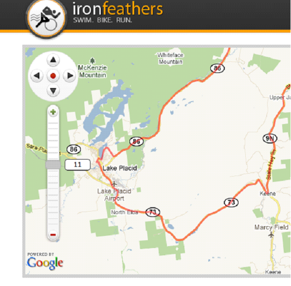
Note that we’ve used a custom set of controls on the map that allow for excellent keyboard accessibility. We’ve also implemented a custom slider control to replace the standard Google Maps control.
We don’t have a native slider element in HTML (at least not at present), so we built the slider with HTML, CSS and JavaScript such that it approximates the visual appearance and functionality of a slider control. The problem is that when we do so, we’re really creating a complex user interface component that is comprised of semantically meaningless divs, spans, images, links and buttons.
The whole is greater than the sum of its parts; taken together, those divs, spans, images and links create something more (a slider). ARIA lets us precisely specify the meaning of the whole so that assistive technologies can better understand the whole instead of breaking it down and trying to understand its individual components.
Traditionally we might have used markup something like this:
<a href="#"
      id="handle_zoomSlider">
<span>11</span>
</a>
The link gives us a focusable control that we can use for the slider’s “thumb” that will slide along the rail. The link text tells us the current zoom level (11), which is also displayed on the screen. We’d use a foreground or background image for the “rail” to make it look like a slider, and then we’d apply the appropriate JavaScript to allow us to manipulate the thumb with the mouse and they keyboard.
To assistive technology though, this is just a link with some text in it. There’s no indication of what the link is about or what it does.
How can we make this better? We add some ARIA attributes:
<a href="#"
      id="handle_zoomSlider"
      role="slider"
      aria-orientation="vertical"
      aria-valuemin="0"
      aria-valuemax="17"
      aria-valuetext="14"
      aria-valuenow="14" >
<span>11</span>
</a>
The markup is fairly simple. We did a few things:
role="slider"),aria-orientation="vertical" to specify that it is oriented vertically in the page, and,aria-valuemin="0", aria-valuemax="17",aria-valuetext="14", and aria-valuenow="14").When we use JavaScript to change the position of the thumb on the rail we also change the value of aria-valuenow and aria-valuetext to match the zoom level. The ARIA properties are updated, and provided we’re using the right pieces of assistive technology, we get the appropriate announcements or interaction with that interface component. A screen reader user, for example, will hear that the user interface component is a slider, and they will hear values being read out as the value changes in response to moving the thumb along the rail.
This is what ARIA gives us: the ability to provide better programmatic accessibility for complex user interface components. There’s a lot more detail to it, but that’s ARIA in a nutshell.
Now, then … I told you that to tell you this.
Remember we talked about the idea of Interim Solutions? That’s where ARIA and HTML5 come together.
ARIA has decent support in assistive technology. It isn’t perfect, but screen readers and magnifiers and other technologies are much further along in supporting ARIA than they are supporting HTML5. Why? Quite simply, even though ARIA is still “new,” it is older than HTML5. Assistive technology vendors have implemented support for certain parts of ARIA, and that support continues to grow.
Because of this level of support, we can add ARIA to give us some of the semantics that HTML5 should give us, but isn’t supported in or exposed to assistive technology just yet.
We use ARIA to complement the semantics of HTML5 in the sites that we build. We relaunched our accessibility focused site Simply Accessible in October of 2010 and defined a number of ARIA landmark roles that help give meaning where it can’t be delivered via HTML5 yet.
We added role=”main” to the main content on the page that is also marked up with HTML5’s <article> element. We used role=”complementary” on the <aside> element for the related content in the sidebar. And we used role=”navigation” on the <nav> elements at both the top and the bottom of the page.
See how it works? We are still using HTML5’s elements, but we’re supporting that with ARIA for those assistive technology and browser combinations that don’t “get” HTML5 yet.
We consider things in this order:
Let’s wrap this up with one final example.
In a recent article Accessibility and HTML5 Block Links I talk about some of the issues that the block link structure creates with screen reading technology. In that article I use an HTML5 figure element to express the relationship between the image and the caption that is below it:
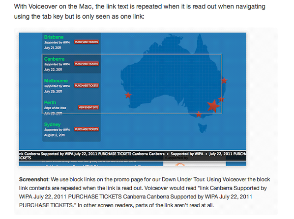
<figure>
<img
      src="../blocklinksvoiceover-500-2.png"
      alt="Screenshot of block links with Voiceover on the Mac.">
<figcaption id="figcaption1">
<strong>Screenshot</strong>: We use block links on the promo page...
In other screen readers, parts of the link aren’t read at all.
</figcaption>
</figure>
This structure creates an explicit relationship where it didn’t exist before. The parent <figure> element contains a <figcaption> element with a sibling <img> element. This HTML5 structure formalizes what people have been doing for years — placing an image in the page and including a paragraph of text after it in the markup.
How does this work for a browser and assistive technology combination that doesn’t understand HTML5? Well, a browser that doesn’t understand an element just skips that element. So when we don’t have full HTML5 support, we fall back to the association by proximity: the image and the paragraph are siblings in the source code, so they must be related.
What can we do, though, for assistive technology that understands ARIA, but not <figure> and <figcaption>? We can create a programmatic association by adding the aria-describedby attribute:
<figure>
<img
      src="../blocklinksvoiceover-500-2.png"
      alt="Screenshot of block links with Voiceover on the Mac."
      aria-describedby="figcaption1">
<figcaption id="figcaption1">
      <strong>Screenshot</strong>: We use block links on the promo page...
      In other screen readers, parts of the link aren’t read at all.
</figcaption>
</figure>
Now there is a stronger association than just having the two pieces of content related by proximity, created by adding ARIA. The value of the aria-describedby attribute does just what you think it does: it contains an id value of the node in the page that describes the content. The detailed description of the <img> is provided by the node with the corresponding id—in this case, the <figcaption>.
What about the case where we have no HTML5 or ARIA support? We fall back to the age-old method of association by proximity: the image and the description are right next to each other in the code.
And that’s Real World Accessibility. It works now and will work better in the future.
Working through these kinds of scenarios is a pragmatic way to learn about Real World Accessibility, and these are exactly the kinds of scenarios we explore—in about as hands-on a way as you can imagine—in our full-day workshops. If you’re in Australia, you can register today, otherwise keep a look out for when we’re in your part of the world.
And in the meantime, let me know what you think about all this.
via Comments on:

We’ve been so busy releasing our two new titles, HTML5 & CSS3 for the Real World and Build Mobile Websites and Apps for Smart Devices – we didn’t notice that our SEO Guide sold out!
Whilst we get ourselves sorted, you’ve got a great opportunity to save a whopping 50% off the Digital Bundle of this popular kit!
Usually $97, you can now grab the PDF, EPUB & MOBI versions of The SEO Guide for only $49!
It will be instantly delivered to your inbox and you can start reading it on your iPhone, iPad, Kindle, or any other mobile device.
The SEO Business Guide gives you proven white hat, SEO information to help you dominate your market, increase your revenue, and gain better job opportunities with your new skills.
This kit also comes with more than $150 worth of added value from THE BEST brands in the SEO business – Market Samurai, AdGooroo and SheerSEO!
via Comments on:
RubySource is looking for people to write on all things Ruby. We are particularly keen to cover these topics, but we’re open to any ideas you have. Best Practices. Transitioning from .NET to Ruby
See more here:
RubySource: Write for RubySource!
via Comments on:
In my previous post you saw how to navigate forward to a new page and then back either via the hardware back button or by calling the GoBack method. Quite often you’ll want to pass some data between pages, for example if a user selects a customer from a list you can pass the customer id or name through to the customer details page. This post will not only cover how to do this, it will also highlight the sequence of events that are raised during the navigation process. For the purpose of this post we’ll be using a simple example application that has two pages, CustomerListPage and CustomerDetailsPage.
View post:
BuildMobile: Navigating with Data in Windows Phone
via Comments on:

The tech media has spent the vast majority of the last week focused on Google’s newest product, an ambitious platform called Google+ that the company hopes will break through their dry spell in the social arena and make them competitive.
It’s early days — for many people it’s next to impossible to even get in — but things are looking positive. The app has been met by a largely positive reception and my stream shows no sign of slowing down as users keep posting after the novelty wears off.
Circles is a foundational feature of Google+, and it’s what makes it so different from other social networks — and bridges the gaps between them. With Circles, you control who you share what information with, making mutual relationships where intimate information can be shared, Facebook-style, a possibility, while still allowing the unidirectional model of Twitter that allows you to follow people you find interesting without them having to follow you back.
The interface for organizing your Circles is pretty cool too, but I don’t think it’s the animations that’s blowing people away.
If I want to make a post that is viewable only by my family members, I can. If I want something to be viewable by the public, that’s possible too. There are no “all or nothing” scenarios here as there are with Facebook. This means Google can perform the roles of both Twitter and Facebook and puts it in a very powerful position.
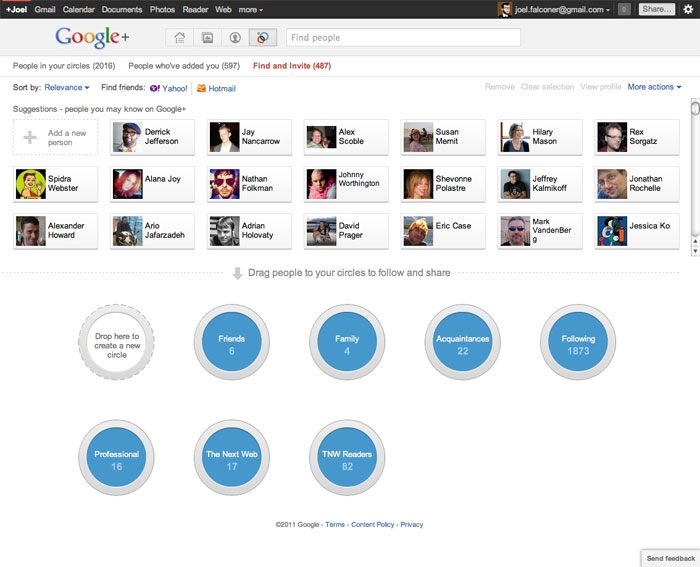
The Circles interface.
The stream is where you can view incoming information. It’s much like the Facebook news feed or your Twitter stream, but Circles gives you control over what you’re looking at here — it’s not just for deciding who to share content with.
In the screenshot below I’m viewing content that has been shared by people I know from my role at The Next Web. I can easily jump between Friends, Family, Acquaintances, or the Following Circle that’s like a bucket for interesting people I’ve never met.
As is the de facto standard today, the stream updates in real-time. There are some issues that Google engineers are actively working to fix — old posts tend to float to the top more easily than on other networks.
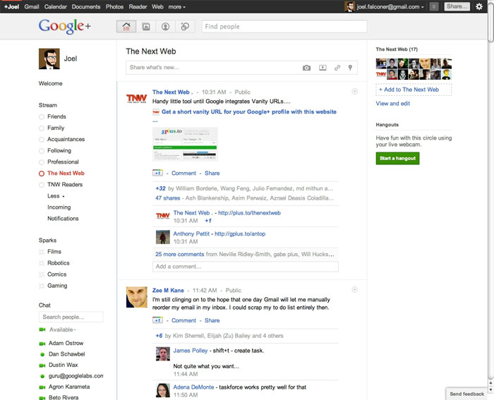
The Google+ stream is the equivalent of your Facebook news feed.
Sparks is billed as one of the main features of Google+ but doesn’t get as much airtime at the moment. That’s because it’s one of the few areas where Google seems to have not invested much effort into creating something truly useful. Sparks are feeds of information based on defined topics, but if you take a look in the screenshot below where I’m looking at the pre-defined Spark called “Films” there’s no curation to the content. The second result has something to do with a sniper shooting a civilian who was filming him in Syria — tragic, but not exactly what I’m thinking of when I want information about recent films.
This feature could be a lot better. It could make discovering and subsequently sharing interesting information a breeze, but not until the results are much better. This would be a perfect place for some sort of integration with Google Reader, where the content has already been curated by both publishers and subscribers.
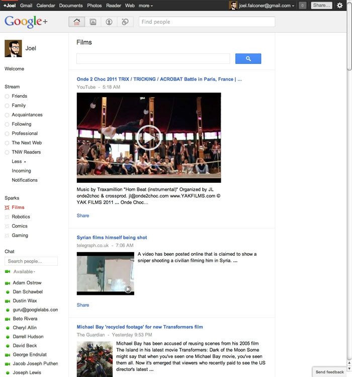
The Sparks interface.
Hangouts is one of the most impressive parts of Google+. The underlying technology isn’t that incredible — we’ve had Skype video conferencing for years. But Hangouts can handle ten or twenty people at a time without problems, and more importantly, it’s not the technology but the execution that makes this feature impressive. Video calls need to be arranged and specific people need to be called in, but with Hangouts, anyone from selected Circles can drop in and out. It’s an evolving social space like your local bar, not a rigid call structure, and that distinction is important. It makes Hangouts pretty revolutionary.
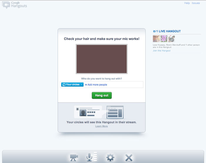
You're given a chance to fix your hair before you enter a Hangout.
No doubt you’re wondering: when’s the API coming? Google says it will be here soon, and if they’re telling the truth they’ll have introduced an API much faster than Facebook did. It’ll be interesting to see what sort of apps come out of Google+ that weren’t possible using other social platforms.
There have been clues that Google+ Games is coming, and rumors that there’s a partnership with social gaming giant Zynga involved. Will Google+ be the next platform for casual game developers to tackle? We’ll have to wait and see, but I’m leaving at the first hint of Farmville spam.
What do you think about Google+?
via Comments on:

Before there were commercials, television, or the Internet, my great-grandfather’s stories would draw crowds and fill seats. One tale he told was of Charlemagne’s court. His medium was a stage, his voice, and 150 marionettes he’d brought from Sicily to America when he immigrated in the late 19th century. His performances were the YouTube of that day.
My dad tells me that people would pay to hear his grandfather’s stories. Today, we’d consider that quaint. Yet, isn’t that what we do whenever we purchase a movie ticket, pay our cable TV bill, or subscribe to Netflix?
From the earliest cave paintings, stories have been an integral part of human history. Every culture that exists or has been known to exist has had a culture of storytelling. One of the earliest surviving records of the origin of storytelling is found in the Papyrus of the Egyptians, in which the sons of Cheops entertained their father with stories. Today, it’s not only movies and books—our music, music videos, and even commercials are all weaved around a story.
If some of the forums and message board postings I read are any indication of how freelance designers, programmers, and copywriters sell their services, no wonder they struggle. Quoting hourly rates, asking for their budget, breaking down the hours so the client can see how much time is involved. How uninspiring (not to mention, completely irrelevant to your client). Here’s all your client cares about: “How can you solve my problem?”
You can answer that spoken or unspoken question more effectively through storytelling than with cold, dry facts. That’s because stories appeal to our emotions—and it’s emotions, not logic, that makes people act. I’m not saying that people never want facts. They do (and you should always be ready with them when the time is right). But it’s much easier to persuade or get someone accept a new idea if you link it to an idea or concept they already understand. Recounting a compelling story makes your point more powerfully than simply stating a fact.
Leo Burnett (the man) famously pointed out that good advertising makes cars drive better and food taste better. He knew how to give good narrative, and he recognized that narrative is (or at least should be) at the center of everything we do as marketers. – Ed Castillo, Adweek: The Song Remains the Same.
So what type of stories should you tell? How about what happened when other clients hired you, took your advice, or started using your product or service? For instance:
That’s a good question, Jim. Let me tell you about the last client we worked with. When he came to us, the company was struggling because they were losing market share. When they went into business in the ‘60s, they were one of just a few companies who did what they do. But over the past decade, technological advances in their industry lowered the barriers to entry, so they found themselves competing against a larger pool of companies providing the exact same service.
They were hoping to leverage the Internet to regain the market share they’d lost. We identified five top competitors they wanted to beat, then devised a two-prong approach: build a website that looked more professional than these five competitors, which wasn’t difficult; and get a high ranking on Google to go toe-to-toe with them on a national level.
We were able to achieve both of those goals, and they’ve seen sales increase as a result. What’s more, when my client showed his boss and their business consultant the site, the business consultant complimented him on a job well done. So I got to make him look good in front of his boss, which he appreciated.
I’ve told that story to clients and used it as an example in my sales training sessions. Isn’t that much more effective than “We built a really nice website for our last client and helped get him top search engine ranking on Google,” then wondering why he hasn’t whipped out his checkbook?
“Let me tell you a story…” Does that make your ears perk up? We’re hard-wired to respond to stories, so start incorporating them in your sales process and watch your client list grow.
via Comments on:
This is another excerpt from the upcoming book “Build Mobile Websites and Apps for Smart Devices” by Earle Castledine , Myles Eftos and Max Wheeler . BuildMobile is exclusively publishing a complete chapter from the book, the chapter on Mobile Web Apps, this is the second section on Events. 2. Events For many users, the most noticeable difference between a website and a native application is the way each one transitions between screens or pages.
See the original article here:
BuildMobile: Mobile Web Apps: Events
via Comments on:

Last week, I explored the idea that raising prices can actually increase business. To many business owners, this is counter-intuitive. Most believe higher prices means less people will do business with them. But is that really the case? Some people have too much business because they charge too little. Others don’t have enough for the exact same reason. Case in point:
There was a shop in New Mexico that catered to tourists. The owner had acquired a number of Native American jewelry pieces, but she was having trouble selling them. Busloads of tourists would come through her store, look at the pieces, and leave without buying. She tried lowering the price, but to no avail.
As a last resort, she decided to offer the entire line at 50 percent off. After scribbling a note for her store manager to do so, she left for a week’s vacation.
Upon her return, she was pleased to discover that all the jewelry had sold. But further investigation revealed something startling. Her manager had misinterpreted the scribbled note to mean she should double the price of the jewelry, and that’s exactly what she did.
The preceding is a true story (I just can’t recall who I heard it from). This isn’t an isolated incident. Here’s the story of a software developer who had the same experience with his product, a consumer-focused productivity application, which he offered for $9.99.
Upon launching the software, Gary emailed every technology blog and journalist he knew to find some media attention for his product, and it worked: a number of major technology blogs covered the launch, and web traffic peaked at 50,000 daily hits over the launch period. Unfortunately, while traffic to the website was great, sales figures were very low: a huge volume of customers were viewing the website and deciding not to purchase the product. In an attempt to resolve this, Gary spent weeks tweaking and then fully re-designing the website, but it had no effect: people simply weren’t buying the product.
By March 2011, Gary became desperate, and out of a desire to begin making some kind of real revenue from the product, he decided to double the price of the software to $19.99, hoping to sell to the same niche of particularly interested customers who were currently purchasing the product, but at this higher price. To his shock, sales of XProductivity immediately spiked, increasing to ten times the number of daily sales he was previously processing.
So is there a corollary that says raising prices automatically results in more business? If it were that simple, we could all charge exorbitant rates and rake in the cash. It’s not quite that simple. Still, the bottom line is that many customers still equate cost with quality.
Yet, a 2009 Cornell study showed that, in two food-related experiments, higher prices didn’t cause the expected higher demand, contradicting previous studies [pdf].
What do you think? Were my two examples anecdotal, merely exceptions to the rule? Or does it depend on the product being sold?
One final thought. Even if raising your prices does cause less people to do business with you, it’s possible that the higher price will compensate for the decreased demand. In other words, selling fewer items at a higher cost may bring in more revenue and profit than your lower price structure did … and with less work on your part, to boot!
via Comments on:

It’s increasingly difficult to keep track of the browser market. Chrome 12, Firefox 5 and Opera 11.5 were released last month. Some browsers auto-update, some don’t. Some vendors have lavish launch promotions, others don’t mention it.
The big news for July is that Chrome usage has passed 20% for the first time. Let’s examine the full StatCounter statistics in more detail…
| Browser | May | June | change | relative |
|---|---|---|---|---|
| IE 9.0 | 4.57% | 6.18% | +1.61% | +35.20% |
| IE 8.0 | 29.06% | 27.67% | -1.39% | -4.80% |
| IE 7.0 | 6.39% | 6.00% | -0.39% | -6.10% |
| IE 6.0 | 3.84% | 3.72% | -0.12% | -3.10% |
| Firefox 5.0 | 0.00% | 2.81% | +2.81% | n/a |
| Firefox 4.0 | 14.23% | 14.04% | -0.19% | -1.30% |
| Firefox 3.5+ | 13.95% | 10.44% | -3.51% | -25.20% |
| Firefox 3.1- | 1.12% | 1.05% | -0.07% | -6.30% |
| Chrome | 19.38% | 20.67% | +1.29% | +6.70% |
| Safari | 5.01% | 5.07% | +0.06% | +1.20% |
| Opera | 1.83% | 1.74% | -0.09% | -4.90% |
| Others | 0.62% | 0.61% | -0.01% | -1.60% |
| IE (all) | 43.86% | 43.57% | -0.29% | -0.70% |
| Firefox (all) | 29.30% | 28.34% | -0.96% | -3.30% |
This table shows market share estimates for desktop browsers. The ‘change’ column shows the absolute increase or decrease in market share. The ‘relative’ column indicates the proportional change, i.e. another 3.1% of IE6 users abandoned the browser last month (yay!) There are several caveats so I recommend you read How Browser Market Share is Calculated.
In June, Chrome 11 toppled Firefox 3.6 to become the world’s second most-used browser. Confusingly, the launch of Chrome 12 has split Google’s user base so Firefox 4.0 has now taken second place. Despite being available for little over a week, Firefox 5.0 has already gained 2.8% market share as Firefox 3.x and 4.0 users migrate.
However, there’s little good news for Mozilla. Firefox’s overall total dropped by almost 1% in June: three times worse than IE and one of the biggest falls the browser has ever experienced. There doesn’t appear to be a particular reason; Firefox 4 and 5 have been well-received but they haven’t halted Chrome’s progress. Perhaps the changes were too radical for some? Or did users investigate other options rather than upgrading?
IE9 has made good gains although IE8 remains the most popular browser version. IE6 and 7 continue to drop although the pace is slowing.
Opera also experienced a small drop. However, version 11.5 may be able to reverse that trend and there’s better news for the company in the mobile arena…
According to StatCounter, desktop browsers account for 93.47% of web activity. Mobile browser usage grew by almost 1% last month to 6.53%. This may be a seasonal anomaly since it’s summer in much of the western world — net users may be out enjoying the sunshine (or drizzle for those of us in the UK).
Movements within the mobile browser market are quite unusual and possibly influenced by seasonal factors. Nokia may be experiencing business issues, but they will be pleased to discover that their (fairly basic) browser has overtaken Android and Safari on the iPhone. Opera has also made gains following the latest release of their mobile editions:
If you’ve not done so already, perhaps it’s time to consider how your business will be affected by the rapid rise of mobile platforms.
via Comments on: