

One thing that puts many people off freelancing before they even begin is the apparently perilous nature of the job. Too many factors seem uncontrollable. Even those who have been freelancing for a while can find themselves in trouble if they’re not diligent and disciplined in their approach — if their freelancing isn’t bulletproof.
What’s bulletproof freelancing? Bulletproof means no misunderstandings. It means everything’s clear, all of the time, and if it’s not, you register that fact and clarify it immediately.
Bulletproof freelancers know where they stand with clients, know what their financial position is, and are always able to address client concerns or work-related issues as — if not before — they arise.
Bulletproof freelancing entails five basic principles.
If we feel wronged by someone, many of us believe it’s okay to retaliate, or to treat them in a similarly disrespectful way.
Not the bulletproof freelancer. You have to keep your cool and your self-respect at all times, which means you must constantly treat your client with dignity, whatever they may do.
I’m not suggesting that you shouldn’t stop working with a client who doesn’t meet your reasonable requests, or treats you in a way you dislike. On the contrary: if you’re always respectful, and you always act professionally, you’ll know when it’s time to end the relationship, and you’ll be in a good position to do so with a minimum of stress or fuss.
The bulletproof freelancer is consciously self-aware. They’re always listening to the little voice inside that starts grumbling when things seem iffy. And they attend to it immediately, registering those concerns, looking at them closely, and working out what to do to rectify them.
To be truly bulletproof, you need to be honest with yourself about your worries, and with your clients. If you can raise any issues as soon as you become aware of them, you’ll gain a reputation for honest dealing and fairness, which your clients will love.
If a client makes a call that you believe will negatively impact the project, you have a professional obligation to tell them so (see point 2 above). Make a point of doing that in person — in a meeting, or at least over the phone. Don’t leave it to email or IM.
In-person discussions will allow you to flesh out issues, explain your concerns in full, and communicate via gestures, expressions, and tone of voice exactly how important the implications of the decision will be. If your concerned about those implications, treat them with due gravity, and arrange a meeting to discuss them.
Of course, giving good feedback on client decisions is also a great way to strengthen relationships and boost communication. Making clients aware of the positive impacts of their choices can help to make you bulletproof from a competitive perspective.
The bulletproof freelancer confirms everything in writing. Not just the project specification, contract terms, budget and timeframes, but also any directives from the client, change requests, and additional information that will affect either the relationship of the project outcome.
For example, once you’ve had your meeting to discuss the potentially negative implications of a client’s decision on a project, send them an email just to itemise what was discussed (the client’s request and your advice to them), and the decision that was reached. Also detail the time or cost implications of that decision, and ask them to confirm that what you’ve detailed is correct.
This way, your client knows where they stand, you know where you stand, and your position and work product remain bulletproof, no matter what the outcome. Freelancers can’t always convince clients to make the best decisions, but as professionals, it’s our job to ensure that they’re aware of what that means for the future of the job.
The bulletproof freelancer overdelivers on every job, and with every client. You can exceed client expectations in many ways — think of it as going the extra mile, rather than spending extra, unpaid hours on the job out of sheer goodwill.
Maybe you’ll give your client weekly emailed status updates or let them know when you hit project mini-milestones. Maybe you’ll take them out for a coffee for your next work-in-progress meeting. Maybe you’ll acknowledge every contact they make with you, whether it’s a missed call or a single-line email. Maybe you’ll make a time to meet in person with others in the client organization that your contact puts you in touch with.
Make overdelivery your policy, and it’ll become second nature. It’ll also help to make you bulletproof: your clients will know you care for them and their projects, and they’ll be more inclined to flexibility and relationship building, than a mere a client-supplier scenario.
Bulletproof freelancing is ultimately about strength: the strength of your character, your professionalism, and the client relationships you develop. Are you a bulletproof freelancer?
Image courtesy stock.xchng user m4tik.
via Comments on:

In my previous post we created a new WordPress plugin which simplified the administration panels for your clients. If you haven’t read it, please do so first. In this article, we’ll use the same plugin file for deeper configuration changes.
WordPress informs you when an update is available. Unfortunately, it tells everyone — including your clients. That could lead to unnecessary concern or tempt them call you every half an hour until it’s upgraded.
Append the following code to easy-admin.php to remove the notification for everyone except for WordPress administrators:
function no_update_notification() {
	if (!current_user_can('activate_plugins')) remove_action('admin_notices', 'update_nag', 3);
}
add_action('admin_notices', 'no_update_notification', 1);
You can remove dashboard widgets for a user by logging in as them and un-checking items in the “Screen Options” pull-down panel. However, that may not be practical and there’s nothing to prevent your client re-enabling them.
Append the following function to easy-admin.php to remove unnecessary dashboard widgets. You may need to add, remove or modify unset commands as required. For example, the first section (lines 5-7) removes “Right Now” for everyone but WordPress administrators. The second section (lines 9-13) removes widgets regardless of the user’s rights.
The dashboard widget’s ID is assigned to its box div element — use Firebug or inspect the source to find that value.
// remove unnecessary dashboard widgets
function remove_dashboard_widgets(){
	global $wp_meta_boxes;
	// do not remove "Right Now" for administrators
	if (!current_user_can('activate_plugins')) {
		unset($wp_meta_boxes['dashboard']['normal']['core']['dashboard_right_now']);
	}
	// remove widgets for everyone
	unset($wp_meta_boxes['dashboard']['normal']['core']['dashboard_plugins']);
	unset($wp_meta_boxes['dashboard']['normal']['core']['dashboard_recent_comments']);
	unset($wp_meta_boxes['dashboard']['normal']['core']['dashboard_incoming_links']);
	unset($wp_meta_boxes['dashboard']['side']['core']['dashboard_primary']);
	unset($wp_meta_boxes['dashboard']['side']['core']['dashboard_secondary']);
}
add_action('wp_dashboard_setup', 'remove_dashboard_widgets');
Few developers use all the features WordPress has to offer. For example, if all posts are assigned to a single default category, you don’t require the Categories box. Or perhaps you’re not permitting comments and can remove associated boxes.
Append the following function to easy-admin.php to remove unnecessary meta boxes from the posts and pages panels. You may have to add or remove remove_meta_box() calls in this function. The first argument is the ID assigned to the box’s div element — again, this can be discovered in the source or with Firebug.
// remove unnecessary page/post meta boxes
function remove_meta_boxes() {
	// posts
	remove_meta_box('postcustom','post','normal');
	remove_meta_box('trackbacksdiv','post','normal');
	remove_meta_box('commentstatusdiv','post','normal');
	remove_meta_box('commentsdiv','post','normal');
	remove_meta_box('categorydiv','post','normal');
	remove_meta_box('tagsdiv-post_tag','post','normal');
	remove_meta_box('slugdiv','post','normal');
	remove_meta_box('authordiv','post','normal');
	// pages
	remove_meta_box('postcustom','page','normal');
	remove_meta_box('commentstatusdiv','page','normal');
	remove_meta_box('trackbacksdiv','page','normal');
	remove_meta_box('commentsdiv','page','normal');
	remove_meta_box('slugdiv','page','normal');
	remove_meta_box('authordiv','page','normal');
}
add_action('admin_init','remove_meta_boxes');
The favorite actions button resides in the WordPress header next to the “Howdy” message. It normally provides quick links to New Post, Drafts, New Page, Upload and perhaps a few plugin-specific options such as “Empty Cache”. Let’s remove the options we don’t require by appending the following code to easy-admin.php:
// remove favorite actions
function remove_favorite_actions($actions) {
	if (!current_user_can('activate_plugins')) {
		unset($actions['edit-comments.php']);
	}
	return $actions;
}
add_filter('favorite_actions', 'remove_favorite_actions');
In this example, we’ve removed the Comments link for everyone except administrators. To remove other items, you need to find the action’s URL in the page source. Locate the element with the ID “favorite-actions” and, within that, an element with the ID “favorite-inside”. The child divs contain links to URLs such as “media-new.php”. To remove that option, simply add unset($actions['media-new.php']); to the function.
Phew. In my next WordPress post, we’ll address the WordPress menu and remove all the dangerous options you want to hide from clients.
via Comments on:
If you’ve been waiting to upgrade to Firefox 4, you’re too late! As promised, Mozilla released Firefox 5 on June 21 2011 — just three months after version 4 was launched. The organization has embarked on a Chrome-like release-little, release-often rapid-update schedule.
If you’re too excited to read further, download the installer from getfirefox.com or update by selecting Help > About Firefox > Check for Updates. You may be lucky enough to receive a fast incremental update — it didn’t work for me and the full installer was downloaded.
Firefox 4 was a major update. You’re unlikely to spot any immediate differences in version 5 since most of the changes are under the hood:
Developers should also note that setTimeout and setInterval events will only execute once per second or less frequently on inactive tabs. It replicates the behavior of requestAnimationFrame to save CPU and power consumption.
Great — but there’s a downside. You may find several of your add-ons are disabled by Firefox 5. They should work, but many authors have not yet updated their add-on’s version numbers. Firebug and the Web Developer Toolbar are fine, but Console2 and HttpFox are blocked.
Not every plugin author has the time or resources to match the new schedule. It’s unfortunate and I hope Mozilla can address the problem. Perhaps a less formal approach could be adopted which allows the community to test and approve plugins without relying on the author to hard-code supported versions. Alternatively, Mozilla could have simply released Firefox 4.1 — the numbering is becoming increasingly irrelevant.
Despite the add-on hassles, it’s good to see updates appearing more regularly. Let us know what you think of the Firefox 5.
via Comments on:
 One often vaunted feature of Android are the Home screen widgets. The official definition of a widget, taken from the Android documentation is: App Widgets are miniature application views that can be embedded in other applications (such as the Home screen) and receive periodic updates. In practice, widgets are generally only used on the Home screen. Widgets can also be interacted with, reacting to touch events, although there are some limits on what can be done
See the original article here:
BuildMobile: How To Code an Android Widget
via Comments on:

Just when you thought you’d had enough football (or maybe not enough, in some cases) FIFA, the international football organization revealed the logo design for the next world cup which will take place in Brazil in 2014. The new design entitled “Inspiration”, was the winning submission, chosen from 25 entries. The judging panel included famous Brazilians, model Gisele Bundchen and author Paulo Coelho. The logo was designed by Sao Paolo-based agency Africa .
See more here:
DesignFestival: Behind the Brazil 2014 World Cup Logo
via Comments on:

My first paid freelance job fresh out of design school was creating a brochure for a magician. Having moved beyond performing for children’s parties, he began doing “magic with a message”—shows designed to teach kids how to avoid drugs and strangers. The ideal venue for his show was high schools, and his target market was high school principals. The brochure was to be part of his marketing collateral.
Besides being an excellent magician, he is also a savvy marketer. Instead of images of himself performing magic tricks, the photos he provided were faces of delighted and awe-struck kids watching him perform. His reasoning was surprisingly astute. Rather than focusing on the magic, he wanted to draw attention to the experience. Showing how he created “insanely great experiences” for his audience is what caused his target prospect—namely, high school principals—to book an engagement.
As in my earlier article, this title comes from the ebook, Innovate the Steve Jobs Way: 7 Insanely Different Principles for Breakthrough Success. Like my marketing-savvy magician friend, Apple seems to get the concept that people buy experiences rather than products. Their recent iPad commercial tells us that “now, we can watch a newspaper … listen to a magazine … curl up with a movie … and see a phone call.” Verizon, on the other hand, is telling us that their tablets are “flash-ready,” come equipped with a “core Tegra 2 chipset,” and are “4G LTE upgradeable.” And while that might send chills up yours and my techno-spine, it does nothing for someone like my technologically-challenged mother-in-law, who was impressed by the fact that “you just touch it to make it go where you want.” Even she can have an “insanely great experience”—but only with the tablet manufacturer smart enough to tell her so.
But “insanely great experiences” are not limited to using the product or service. People also want “insanely great experiences” when buying a product or service. Consultant Alan Weiss calls this creating “breakthrough relationships.” One way he suggests to do this is by keeping a record of important issues facing your existing clients and key prospects (regardless of whether you are working with them on these issues or if they are out of your area of expertise), then sending articles and other useful resources on that topic.
Let’s face it. Our prospects are not going to experience roller coaster thrills over the website we’ve developed for them. (In fact, you really didn’t develop the website for your prospect at all. You developed it for his prospects, clients, customers, or patients.) So what type of experience can you create during the buying process itself?
Over the past decade, I’ve seen website development go from what most people thought was some type of voodoo magic to something a teenager can do. Next year, my fifteen-year-old son will be learning in high school what I went to graphic design college (and re-paid thousands of dollars back in student loans) to learn. When kids coming out of high school know much as you did when you graduated college (if you did), your skills have become commoditized. Sure, you’re going to develop a great site. Of course it will have a professional look, be standards-complaint and search engine friendly. But those things are “the cost of entry” if you want to compete in this field—not what sets you apart. Creating “insanely great experiences” during the buying process may be the only hope you have left.
Neil Rackham (SPIN Selling) and Michael Gerber (The E-Myth Revisited) concur. In an article entitled, “From Valve Communication to Value Creation,” Rackham says that “…value is migrating from the product itself to how the product is acquired.” (Italics mine.)
Michael Gerber says that the commodity isn’t what’s important—the way it’s delivered or acquired is. According to Gerber, the entrepreneur considers the business to be the product, not what he delivers to the customer. He looks at the business “as if it were a product, sitting on a shelf and competing for the customer’s attention against a whole shelf of competing products (or businesses).”
This means “how the business interacts with the consumer is more important than what it sells.”
The commodity is the thing your customer actually walks out with in his hand.
The product is what your customer feels as he walks out of your business.
What he feels about your business, not what he feels about the commodity.
- The E-Myth Revisited
Yesterday, I got a haircut at a place I’d never gone to before. Although I was very happy with the end result, the girl cutting my hair looked as though she’d rather be anywhere else than where she was. The stylist the next chair over was the polar opposite— gregarious and outgoing, making conversation with her client … and I began wishing I’d gotten her instead. Don’t get me wrong, just like my haircut, your client ought to be thrilled with the site you developed. But a large part of that thrill includes the process of how he obtained the site. Did you create an “insanely great experience, or did you leave your client wishing the developer “the next chair over” had built his site instead?
via Comments on:

Given that Dan once ran RubySource and I’d already put a face to the name at one RORO meeting a couple of weeks earlier, it was stellar to actually get to know him better over the weekend. Additionally, I felt the title of Unplugged was justified, as he was playing acoustic guitar through the weekend. He’s as friendly as he is tall, which is taller than average, so he was happy to answer some questions for us! Tell us a some things about yourself, Dan. I started programming using BASIC when I was six, I sort of progressed from there through basic C, Pascal, Visual Basic, until I discovered the web in about ’95 and thought “right, this is for me”.
Link:
RubySource: Dan Cheail, Unplugged.
via Comments on:

WordPress’s popularity owes much to it’s easy administration panels. Unfortunately, it can still be daunting for non-technical users such as your clients. At best they’ll require a little training, hand-holding and support. At worst, they’ll play around with plugin installation, edit some theme code, then expect you to clear up the mess.
I’ve written a number of “Make WordPress Easier for Clients” articles (see part 1 and part 2). In those examples, code was placed in the theme’s functions.php file. That’s still a viable solution if you have one WordPress installation per client or each is configured differently.
In this article, however, we’ll create a plugin. Plugins have a couple of advantages:
Our plugin will be contained in a single PHP file. We’ll name it easy-admin.php and place it in the WordPress plugin folder (wp-content/plugins/). Ideally, the file should be UTF-8 encoded. If your text editor doesn’t permit UTF-8, well, use a better editor! That said, those using English are unlikely to experience issues with ANSI-encoded files.
A PHP tag and header comments are required at the top of the file, e.g.
<?php
/*
Plugin Name: Easy Administration
Plugin URI: http://www.sitepoint.com/wordpress-easy-administration-plugin-1
Description: Simplifies WordPress administration panels.
Version: 1.0
Author: Craig Buckler
Author URI: http://optimalworks.net/
License: GPL2
*/
You can change the header details, but ensure the definition tags remain — WordPress uses them to recognize your plugin.
You can now install your plugin by activating it in the “Plugins” section of the WordPress administration panels. Those with a WordPress network can activate it for all sites in the “Network Admin” section. It won’t do anything yet, but you can now add whichever features you require…
The WordPress logo is lovely but few clients will care what CMS they’re using. It might be more helpful to show their site name. Append the following code to easy-admin.php; it replaces the login page logo with the name and uses a pleasing CSS3-letterpress text:
// login page logo
function custom_login_logo() {
	echo '<style>h1 a, h1 a:hover, h1 a:focus { font-size: 1.4em; font-weight: normal; text-align: center; text-indent: 0; line-height: 1.1em; text-decoration: none; color: #dadada; text-shadow: 0 -1px 1px #666, 0 1px 1px #fff; background-image: none !important; }</style>';
}
add_action('login_head', 'custom_login_logo');

The WordPress icon is shown next to the site name in the header. There’s nothing wrong with it but some clients will question why there’s a ‘W’ next to their site. To remove it, append the following code to easy-admin.php:
// remove administration page header logo
function remove_admin_logo() {
	echo '<style>img#header-logo { display: none; }</style>';
}
add_action('admin_head', 'remove_admin_logo');
The footer provides links to WordPress, documentation and feedback. Few clients are likely to find it useful so you can replace it with your own support details. Append the following code to easy-admin.php and change the echo statement to output to a suitable message:
// change administration panel footer
function change_footer_admin() {
	echo 'For support, please call 123456 or email <a href="mailto:support@mysite.net">mailto:support@mysite.net</a>';
}
add_filter('admin_footer_text', 'change_footer_admin');
The dark-gray Admin Bar was introduced in WordPress 3.1. Personally, I don’t find it particularly useful. It can also confuse clients; they may think all visitors can see the bar or use it to access dangerous features such as ‘Appearance’. Fortunately, we can remove it with one line in easy-admin.php:
// remove admin bar
add_filter('show_admin_bar', '__return_false');
That’s enough configuration for today. In my next WordPress post, we’ll add further functions to simplify the dashboard, post and page panels.
via Comments on:

So far we’ve looked at the importance of notifications on the Windows Phone platform along with the different types of notifications that are available to your application. In this post we’re going to go through setting up your application to receive notifications and how to actually send notifications. The first step in configuring your application to receive notifications is to register with the Microsoft hosted Push Notification Service. This is done by creating an instance of the HttpNotificationChannel class and calling the Open method.
Read More:
BuildMobile: WP7 Push Notifications Part 2
via Comments on:
So far we’ve looked at the importance of notifications on the Windows Phone platform along with the different types of notifications that are available to your application. In this post we’re going to go through setting up your application to receive notifications and how to actually send notifications. The first step in configuring your application to receive notifications is to register with the Microsoft hosted Push Notification Service. This is done by creating an instance of the HttpNotificationChannel class and calling the Open method
See original article:
BuildMobile: WP7 Push Notifications Part 2
via Comments on:

I was recently speaking to someone who had made the decision to leave her freelancing business, and take a full time position within a company who didn’t offer her services.
As you can imagine, her clients stuck by her, however she was starting to find it harder to manage both roles. I gave her some advice, which she acted on and was pleased with the outcomes, and wanted to share it with you.
Before taking the plunge of employment, I suggest approaching those in the local industry that you know and trust. If you don’t know them, that’s fine; but it’s important that you find a few people who you know do great work.
Once you’ve established a list of three to five names, contact them and arrange a coffee date. Then, at this meeting, explain your situation, and that you want to ensure your clients are taken care of into the future.
Once you’ve interviewed these folk, and have a good feeling about their ability to service your existing clients, don’t feel shy in asking for something in return. You’re bringing your existing clients and work – that’s got to be valuable, right?
The easiest solution is to agree on a percentage you’ll receive as a commission for each new job they get from your clients, for a period of time (my suggestion? Six months).
Ideally, have a few of these arrangements, and then communicate to your clients. Let them know you’ve enjoyed working with them, however you’ve decided to exit the industry, and here are a few names of people that you would recommend.
Don’t just do it by email either – a telephone call costs very little apart from some time, and ensures your clients understand your position, and you still have a great relationship moving into the future.
The end result is a group of happy clients, who you know will be looked after into the future, as well as a passive income stream for the next few months, as they continue the great work that you started.
Best of luck in the new role, and congratulations on a successful freelancing exit!
via Comments on:

WordPress has announced that the initial release candidate of WordPress 3.2 is now available, meaning that the general release of WordPress 3.2 is right around the corner.
There are some really cool new features and improvements sure to make a lot of folks happy, but there are also some significant changes in WordPress requirements that you should be aware of, lest you click the magic upgrade button in your WordPress admin and be disappointed.
Here are the top seven points you need to know about WordPress 3.2:
As most of us know, keeping WordPress up-to-date is extremely important. It’s easy to understand how WordPress installations remained out of date prior to the automated update features being added to core WordPress several versions back, but these days there’s almost no excuse.
It never ceases to amaze me how often I work on a new client’s existing WordPress website to see them running versions of WordPress as old as 2.7 and 2.8. Because of its incredible popularity, WordPress is constantly targeted by hackers looking to exploit security vulnerabilities in the system. These vulnerabilities are usually caught and patched, resulting in incremental updates that keep WordPress fresh, clean and safe.
By not keeping your WordPress installation current, you risk falling victim to malicious attacks that are entirely preventable—given that you actually guard against them by updating your code.
With that said, WordPress has up until this point been a very pleasant citizen, being more than happy to work with you and live on older, antiquated web servers. This has meant that WordPress has essentially been backwards compatible, happily supporting MySQL4 and PHP4. However, try to upgrade WordPress to 3.2 on a server that doesn’t have either MySQL5 or PHP5, and you’ll see something like this:
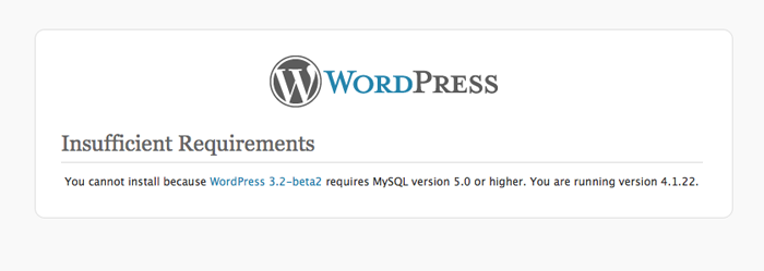
MySQL5 and PHP5 systems have been running stable now for several years and they collectively add quite a bit of functionality, but there are still servers out there that run old web services for any number of perfectly valid reasons.
If you are currently hosting with a larger hosting provider like Hostgator, Bluehost, Softlayer, Rackspace, LiquidWeb or the like, don’t sweat it—you are probably just fine. But if you happen to be with a smaller hosting company, have an account with several “legacy sites” that require older services, or are even running your own server, you may end up needing to upgrade both WordPress and the server it lives on.
If you don’t know whether or not your sites are running on a server that will support WordPress 3.2, there’s a handy little plugin written by Ryan Duff called WordPress Requirements Check. Just download it and add it to your WordPress installation, and it’ll let you know whether or not you are ready for the next version of WordPress.
So don’t be caught with your pants down—the official release for WordPress 3.2 is slated for on or around June 30th, so there’s still time to clean up your act and be able to join in the fun!
Considering that even Microsoft is counting down the days till none of us ever have to deal with that wretched Internet Explorer 6 ever again, the official dropping of support for IE6 is hardly a surprise.
Still, seeing it in online print should give seasoned web development veterans warm fuzzies on some level. IE7 is also on the way out, though WordPress won’t officially drop support for it for a little bit yet.
Now that we’ve covered the important stuff that is going away that you need to be aware of, let’s talk about what’s new and good coming to a WordPress installation near you soon! We’ll start with the new and improved, streamlined WordPress administration interface.
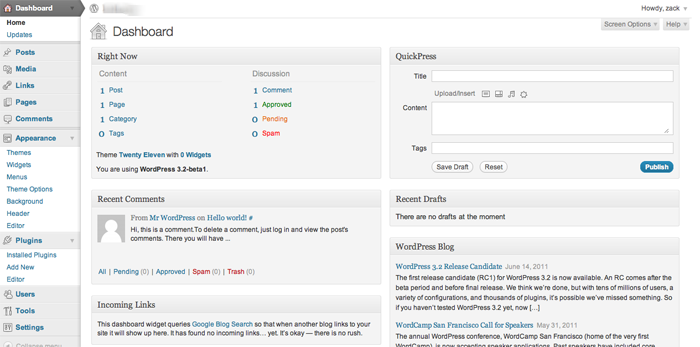
With the release of WordPress 3.0, we were introduced to a lighter, friendlier feel in the WordPress administration interface, and the refreshed version of the WordPress 3.2 interface seems to build further in that direction.
I really like how WordPress has continued to make a concerted attempt to get out of your way, removing unneeded clutter, compressing the width of the left hand sidebar significantly, and reducing the height of the admin header.
Further, the contextual screen options menu initially introduced in WordPress 3.0 really shines in 3.2. They essentially work the same way, but it’s a bit more intuitive now with the rest of WordPress being so out of the way now. If you have never had the chance to play with the contextual Screen Options, have a look at how the work in the two screenshots below:
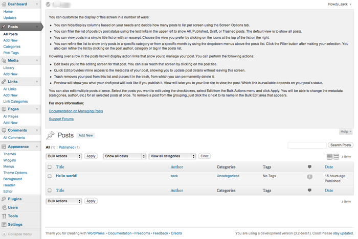
As you can see, utilizing the screen options when you work with posts, shown above, provides different options to working with screen options when working with links, as is shown in the screenshot below.
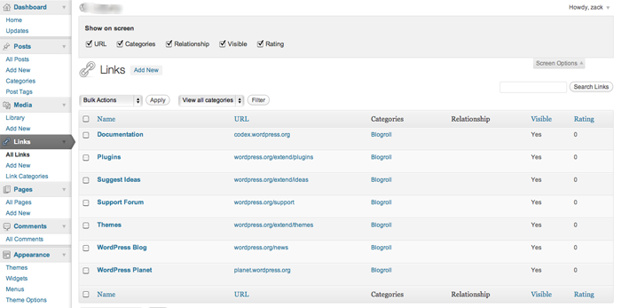
The Help button is also contextual in this same manner, so if you aren’t sure how to proceed somewhere in any given section of the WordPress administration interface, you are always treated to pertinent assistance as shown in the example below.
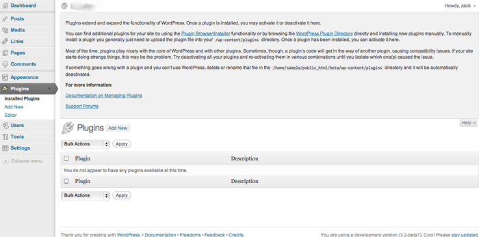
Continuing the theme of staying out of your way, WordPress also is improving on its authoring experience by enhancing the existing fullscreen writing mode. While you’ve always been able to edit a post in fullscreen mode if you like, the experience has been streamlined in a very Ajax-y kind of way.
Open up the fullscreen mode form the editor and you’ll initially see a fairly minimal screen that gives you only essential authoring options, like the ones you see below.
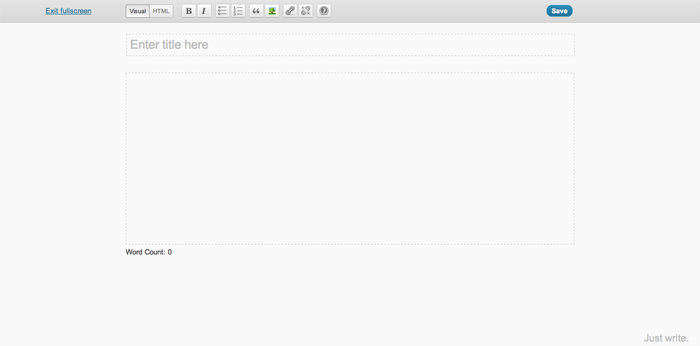
However, stop monkeying with your mouse for a minute or two, and all of that magically fades away in the background, leaving only a gray screen with a flashing cursor. This eliminates all the clutter from your screen—aside from WordPress’s gentle reminder in the bottom right hand corner to “Just write”.

Move your cursor again, and the fullscreen view reappears, giving you formatting options just as before, as well as the ability to save your work. Pretty cool stuff, and a welcome addition for the serious blogger.
Another really significant development with 3.2 is how much the development team has trimmed the fat and optimized the speed of WordPress. The core development team has completely re-factored the core code in WordPress, removing deprecated functions and making things overall run much more efficiently.
This results in faster page loads, faster upgrades, and faster plugin additions, and it all really shows when you are just playing around with the admin interface. Further, the switch from PHP4 to PHP5 offers significant speed increases as well.
Especially with Google making changes to factor website speed and performance into organic search engine rankings, this is a massive boost for WordPress, and does nothing but help make it a sturdy platform for growth moving forward.
Another important feature that has been implemented with 3.2 revolves around WordPress upgrades. While in the past, upgrades were full replacements of core code, the system has been modified to now only replace files that have actually been modified and need to be changed out.
This makes the upgrade process faster, as there are fewer files to download and swap out. More importantly, it also makes the process safer and much more reliable, reducing the possibility of download errors significantly due to the decreased volume of code being downloaded.
If all of that wasn’t enough, WordPress has also given us a new default theme to play with, if we so choose. Twenty Eleven looks like a fairly solid theme for something default and free, giving you a much larger array of options for customization that its’ predecessors have.
Starting with two default color schemes – a light one and a dark one – out of the box, Twenty Eleven gives you several solid options including the ability to easily change the overall layout into several different configurations as you can see in the screenshot below.
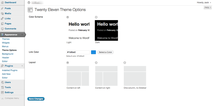
You can also change the text color, and upload your own graphic headers right through the theme options. Random header images per page are also supported, as is the ability to upload and work with your own custom background.
All of these things are pretty easy to code into any custom theme anyway, but it’s nice to see WordPress making it easier for people to quickly build out a website and make it look different that the standard Twenty Ten install we’ve all come to know and identify so easily on countless WordPress installs across the Web.
The new WordPress features will all be pretty useful, but at the end of the day the most important thing to keep in mind with the upcoming release is that you need to be certain you are ready for it on a server level.
That said, the speed improvements alone are enough to get this developer pretty excited about the release of WordPress 3.2 (not that it was overly slow before), and I think that the revamped full screen experience should be a nice addition for frequent content editors doing a lot of work within the system.
What about you? Is your server ready for WordPress 3.2, and what are you most excited to see in the new release?
via Comments on:

In my last article, I talked about the difference between Tactical thinking and Strategic thinking. In a nutshell, Tactical thinking is “doing things right,” while Strategic thinking is “doing the right things.” Strategic thinking is typically leadership: creating the vision. Whereas Tactical thinking is management: implementing the vision.
When it comes to strategic vs. tactical planning, it’s easy to fall into either/or thinking—that is, either strategic thinking is better, or tactical thinking is better. This is especially true when you realize which type of thinker you are. We tend to believe that our type of thinking must be superior. But regardless of whether you are a strategic or a tactical thinker, you must come to realize that both types are critical to success; and you must learn to appreciate your business partner and/or your employees’ way of thinking and value the contribution they can make towards accomplishing your goals.
So when I use the term strategic vs. tactical thinking, it’s not to imply that they are at odds with one another; rather it’s to contrast the difference between the two, so you can begin to distinguish and appreciate those differences. It’s also critical to recognize when you are not applying both types of thinking to the situation.
Difficulties arise when one or the other, rather than both, is used to tackle a problem. Strategic thinkers tend to analyze the situation but often fail to take action. “Paralysis by analysis” is their downfall. Tactical thinkers are all about “doing something,” but they often don’t think before springing into action; so oftentimes, their action is ineffective, and perhaps unnecessary. If only they’d taken the time to step back and analyze the situation beforehand.
Think of strategic and tactical thinking like the strings of a violin. In order for the instrument to create beautiful music, each string must have tension applied to both ends. If tension is released from either side, then the music it was intended to create cannot be produced.
The apparent tension between strategic and tactical thinking is seen in the statement, “Doing Things Right vs. Doing the Right Things.” Tactical thinkers tend to focus on “doing things right,” and strategic thinkers are concerned with “doing the right things.” But let’s consider that statement for just a moment. If you do something “right,” but it’s the wrong thing to do, your efforts will be futile. Conversely, if you do the “right thing,” but you do it wrong, you’ll also fail miserably.
“Strategy without tactics is the slowest route to victory. Tactics without strategy is the noise before the defeat” – Sun Tzu
Let me give you a couple of examples.
When my partners and I began our web development business, one of the “things” we did to find clients was cold-calling. Today, I run a telemarketing department, so I know something about it. But eight years ago, I was completely ignorant on the topic. Without a script or much of plan, we opened the phone book and started calling.
As you can imagine, we were less than successful. We landed two very small jobs (one of which we ended up refunding the money), so we decided that cold calling wasn’t the way to find clients in our market. It wasn’t until a few years later that I met some colleagues who were having great success with cold calling. One even told me that it was the primary way he gained new business. Our failure caused us to conclude that we were “doing the wrong thing,” when in reality, we were “doing the thing wrong.”
A few years later, I met a business woman whose product was coffee gift baskets. Previous to this, she’d been a freelance computer programmer and IT consultant. As most of you know, the primary way a person in that field gets business is through networking: belonging to groups such as chamber of commerce, establishing relationships with people that could become clients or who know others who could become clients. Much of this type of work is gained by “word of mouth.” Jackie knew this and was good at it. And since that was all she knew, she was using it for her coffee gift basket business.
The problem was that, unlike computer programming, where she only needed maybe one or two new clients every few months to make a living, Jackie needed to sell several dozen baskets each week to make a profit. What Jackie needed was a website and a retail outlet to expose her product to the public. Networking meetings were getting her one or two sales, at best, a month. If Jackie had been a different type of person, she might have concluded that she was “doing the thing wrong” and tried harder—more networking meetings, talk to more people, and so on. Fortunately, she realized that, although she was “doing the thing right,” it was “the wrong thing” to do for her new business.
So let’s get away from either/or thinking, and engage in both/and thinking: both strategic thinking and tactical thinking are critical for success.
via Comments on:

Episode 117 of The SitePoint Podcast is now available! In this week’s show, our host Louis Simoneau (@rssaddict) interviews the legend of web design podcasting that is Paul Boag (@boagworld). We get to hear about the new seasons of podcasts Paul is doing which chronicle the method used while re-designing the Boagworld website, from mood boards to the HTML5 coding and responsive web design.
Play this episode directly in your browser — just click the orange “play” button below:
You can download this episode as a standalone MP3 file. Here’s the link:
The SitePoint Podcast is on iTunes! Add the SitePoint Podcast to your iTunes player. Or, if you don’t use iTunes, you can subscribe to the feed directly.
Louis: Hello and welcome to another episode of the SitePoint Podcast. Today on the show I’m very happy to have with us another illustrious podcaster in the web design world, Paul Boag, hi Paul.
Paul: Hello, good to meet you and good to be on the show, thanks for inviting me.
Louis: Absolutely, it’s a pleasure. I’ve been told by Patrick, who you know, to thank you for any influence you may have had for judging the .net Awards where the show won The Best Podcast Award, so his thanks to you. I didn’t have anything to do with the show at that point so I can’t really thank you for that directly, but yeah, so it’s good to have you on the show.
Paul: It’s good to be on the show, and you guys have been going for a good length of time now.
Louis: We’re getting there, we’re in the — what is this, I think this will be 118 or 117, so pretty good, getting there, not quite the venerable age of Boagworld.
Paul: Well, nobody’s quite the venerable age of Boagworld unfortunately.
Louis: I definitely remember. I remember listening to possibly the first few episodes you did.
Paul: That must’ve been painful.
Louis: (Laughs)
Paul: It was terrible to begin with; it was just me droning on in the mic without any company or any banter or anything that people have come to like from the show. We’ve actually put on the very first episode now, we got a health warning at the beginning
Louis: You’ve added in a little bit?
Paul: yeah, we’ve added in a little bit saying ‘don’t listen to this’.
Louis: (Laughs) just in case anyone should stumble across it.
Paul: Exactly, yeah, we’ve told them to listen to the later episodes, but I think a lot of people still ignore it, it’s interesting.
Louis: So that brings me on to something I wanted to talk about, you guys have done something pretty interesting, you’ve decided sort of I guess retrospectively that the first 200-odd episodes of the show you did were the first season spread out over five years.
Paul: That’s quite a long season isn’t it really?
Louis: I think that might actually be a record, you should look into to phoning Guinness about that; you might be eligible for something. And then so you took a bit of a break and then launched into a second season which is sort of thematically different, do you want to talk a bit about that, it’s pretty interesting.
Paul: Yeah, I mean essentially after 200-plus episodes we were losing a bit of momentum, and to be frank the kind of the burden of doing a weekly show and having to do it every week was becoming problematic to us and our business because of the amount of effort that was involved with it, and I think there wasn’t the same passion that there was initially for it, and I think even listeners were beginning to take the show for granted, and we needed a change, we needed to do something different. And so what we decided to do, you know, we debated should we stop it entirely as our kind of time gone, there are all these other web design podcasts with people that are super-enthusiastic out there wanting to do stuff, so should we just step away from it completely, and we didn’t really want to do that just simply because we do enjoy doing the podcast a lot. So what we decided to do is move to a more TV-based approach to the show which is where we do a season of say six, eight, whatever episodes on a particular subject doing a particular thing, and then essentially what we do is we finish that season, we have a rest, we decide what we want to be the next season and then we repeat the process again. And so far we’ve done one season and we’ve just started the second, and it seems to be working, it makes the show feel much more focused, it makes it feel much more alive again, there seems to be renewed interest, so overall it feels like the right move to do. The other thing that we did with the first season which we’re not doing with the second season, we’ve produced a book that’s associated with that season, and I think that went down very well as well of having this kind of take-away that you can take away from the season as well. So, yeah, it seems to be working well, I’m enthusiastic about it.
Louis: That’s really cool, it’s an innovative idea and especially the idea of bundling it with a book; did you guys self-publish that or did you partner with a publisher for the book?
Paul: Yeah, we decided just to self-publish it. I mean it’s really interesting because I was a little bit unsure about what the best thing to do with that was. And so we’ve just kept it really simple for the first season and we’ve published an e-book associated with it. So it’s a fair length book, six chapters in it, and in that first season it’s about dealing with return on investment, how to build a website that generates a return on investment. And, yeah, we decided to self-publish it; interestingly I was of the opinion of a web designer they would want a physical book anyway, they’ll be quite happy with their Kindle or their iPad or their iPhone or whatever, but I got into an interesting debate on Twitter where everybody told me that actually we still want dead trees and that I’m entirely wrong on that, so apparently it was a false presumption, but there you go.
Louis: It definitely appears to be the case here at SitePoint; we make a pretty good living on sitting in an office that was built on selling dead-tree books.
Paul: Absolutely.
Louis: It seems to be something that people still like to have next to the computer and reference, especially when it comes to sort of instructional stuff for code or even any kind of I’m doing something on the computer which is where I’m working, but then when I want to refer to some advice or instruction about that I can turn away and look at something different. The new season of the Boagworld Podcast that just started, you’ve done one episode so far in the new season if I’m not mistaken.
Paul: It depends on when this interview goes out (laughs), either one or two I’m guessing.
Louis: And so the new season is something a bit different, right?
Paul: Yeah. So, season one which was building websites for return on investment, season two was meant to be client-centric web design; I was going to write another book and do a second season which was going to be looking at the subject of working with clients and how to get the most out of that client relationship, because I get kind of fed up with a lot of the negativity that flies around about clients. But, when I kind of actually sat down to write it, it’s a subject I’m really keen on and still really want to do, but I was kind of looking back at my body of work and going I don’t know I’ve talked a lot about web design and not actually do a lot of it, and I was feeling that I think the thing that’s always held me back with an audio podcast is it’s quite hard to obviously demonstrate things like code and design and that kind of stuff, so I’ve always intended to keep away from the really specifics of, I don’t know, how to approach design or get a mood boards or wireframes or code or anything like that because it’s visual and it’s hard to do. But what I’ve decided to do, and they’ve left me feeling like well everything that we’ve been doing is very theoretical, I’d like to do something that was more practical, more hands-on, getting our hands dirty kind of thing. At the same time I also had this problem whereby the Boagworld website is in desperate need of redesign; when you’ve got a website that’s about web design it should really be using cutting edge technology and all of the rest of it. So I decided to kill two birds with one stone and essentially rebuild the Boagworld.com website as season two, so each episode within the season will tackle a different aspect of the process that I’m going through to rebuild Boagworld. So it’s starting at the very basics in episode one where we’re talking about what are my business objectives of Boagworld, why does the website exist, etcetera, episode two is going to be about target audiences, who are my target audiences, what do I want from them, etcetera, three is going to be a wireframe, four on kind of mood board look and feel, then we’re going to get on to design proper, we’re going to look at usability, accessibility, we’re going to get into responsive design, setting up a WordPress blog, dealing with content, all these different areas going step-by-step through the process right the way through to kind of analytics and AB testing and all that kind of good stuff. So, I’ve really taken this case study and following it through; I think this is going to be quite a long season simply because I think it’s going to take me quite a while to do this.
Louis: Yeah, that sounds like it’s a bit more involved than what you could fit in five or six hours of radio.
Paul: Exactly. So, you know I think this one will go on a while, but I just think it’ll be much more hands-on and much more practical and already the feedback has been superb for it, and I think people are much more excited to see a website evolve. I mean what really kind of got me was being at Future of Web Design this year, and I was watching Mike Kus who is a designer here in the UK, and he gave a talk in which he played a video of him designing a website, it was obviously a time-lapse video to kind of compress it all down, but essentially you watch this website kind of evolve in front of you, and I find those the most exciting talks, the talks where you see somebody’s work, see somebody’s thought process rather than here’s a load of pretty pictures of stuff that I produced previously or alternatively here’s a load of theories; it’s seeing that stuff done in practice I think is so inspiring. But as a podcaster and a web designer it’s absolutely terrifying designing in the open like this and letting everybody see your work and see your thought process, it’s scary because people might be horrible about it (laughter), but I’m hoping not.
Louis: Yeah, I’m sure you’ll do fine in it, and if anything the feedback you’ll get will help you out.
Paul: Well that is what I’m kind of hoping really. I’m just being blatantly honest and transparent about the whole process, and even to the point where the show that I’m recording on Monday is about target audiences, and obviously everybody listening to the show is actually the target audience I’m trying to reach, and so I’m sitting there like talking about all the things I can extract from this target audience, you know, what I want them to do and how I want them to do it, and you’re thinking, bloody hell, should I be talking like this, but let’s go transparent, let’s go on this, let people see the real reasons we do these podcasts, that we do these things and the marketing benefits they provide, etcetera, and just put it out there and see how people respond. And I think normally people respond very positively to honesty, and people are already making some great suggestions about how I can improve the site and stuff that I can do, so I think it’s going to be a good process.
Louis: It will be really interesting. Have you come with a way of how you’re going to deal with the more I guess the bits of it that require more visual parts, so for the bits that are code or even the wireframes and design aspects it’s hard to convey that through audio, as you were mentioning earlier; what’s the plan?
Paul: I mean, yeah, you’re right, there are going to be some limitations. What I’m intending to do, I think, I’m still kind of playing with it because we’re at the early stages where it’s a lot of still theoretical, stuff like business objectives and target audiences, not a problem yet; I think when we get on to design then that’s where I think the show notes will become really important, I mean I’ve always taken an approach with podcasting where my show notes were essentially a blog post about whatever we’re podcasting on, so people will be able to go and see designs and mood boards and all the rest of it there. When we kind of get to the coding stage I don’t know, I mean obviously again the blog post could do that and you could show examples of code and stuff, I’m half toying with the idea of setting up a development site online somewhere, where people could actually see the website in bits, they can see the un-styled HTML, and as I add the CSS on top of it and all of that kind of stuff. I don’t know yet whether I want to do that or not, so I’m kind of still playing with ideas; it will be interesting to see what people think, and I’m sure they’ll let me know how they want me to do it.
Louis: It will be interesting to get to play with a lot of the newer technologies that are becoming sort of available now, we recently did a book on HTML5 and CSS3, and it’s sort of shocking to see how much stuff has changed. Maybe as I’ve been working in books for a little while and you’ve been working more with clients and on the podcast, if you haven’t actually gotten your hands dirty with code in a little while, when you come back and, oh wow, there’s a lot of different stuff we can do now that we couldn’t do the last time I tried to do this.
Paul: I know; it’s so exciting, even because I’ve already started building bits and bobs of the site, I’m trying to keep ahead of myself so that things that take longer aren’t going to hold the show back, if that makes sense. And already I’m starting to play with things like responsive design and some of the CSS3 stuff that’s going on, and looking at mobile, and to be honest it really excited me there’s just so much; I’m going to sound like an old man now but it’s so much easier than it used to be.
Louis: (Laughs) Well, that’s definitely the truth. We used to spend, and this is going to actually kind of lead on to the other thing I wanted to talk about today, but we used to spend hours or even half a day messing with getting rounded corners on a flexible box to not break.
Paul: Yeah! And now it’s a line of code. So, yeah, absolutely really excited, I mean I do have the advantage, and one of the exercises I need to go through and did go through as part of the show is looking at my analytics and all the rest of it, and I’m in a spoiled position that I think that 10% of my users use IE, and out of that 10% almost all of them are on IE9, so, you know, I’m spoiled in that I don’t have to worry as much about kind of it working in older browsers, although I am going to try and address that just simply because otherwise I’m missing out on a big part of the problem that people face. But, you know that is just brilliant that you can shortcut so much stuff now by using some of these advanced selectors and advanced styling and all of that kind of stuff, and I’m loving responsive design, I just think that’s the coolest thing ever.
Louis: Yeah, I was just going to say it used to be one of those things where you’d start a site and think, ah, you know, do I go fluid or fixed and fluid can look ugly sometimes and fixed who knows what’s going to happen if monitors get huge, and now you don’t even have to worry about it, you can just do it once and it can look good as much time as you’re willing to put into every sort of step along the way, it can look good at any resolution.
Paul: And you know I’m going to spend a bit of time thinking about potentially the future and what will come along and how you can layer in some additional, you know, if suddenly there’s a new resolution that comes out that everybody seems to be using for whatever reason, you can just layer that into the site and the site will adapt without having to rebuild it from scratch and all that kind of stuff. I’m also using another thing that I’m really enjoying using, it’s just making life so much easier, is rems; have you come across these, Jonathan Snook’s article on it?
Louis: I’ve read it but I didn’t really play around with it, I think I just sort of saw it in passing and thought hey that’s pretty cool and then got swept up with something else.
Paul: Yeah, so essentially the thing with REMs, you know, traditionally we’ve all been taught to use EMs as our font sizing, the way that we do font sizing, but the problem with EMs is they’re basically a pain in the neck because you get deeper and deeper because they kind of inherit their value from the parent and so it all gets very complicated working out what value you want in order to get the text a particular size and so on. With REMs what’s so great is they’re set from the root, so if you just set your font size on your html tag and then whatever you set relates back to the html tag, so if you set the html tag as 62.5% that makes one REM equal to ten pixels, so therefore if you want 14 pixels it’s the size of your text and it’s 1.4 and so on, so that made life so much easier, thank you very much Jonathan Snook.
Louis: Yeah, that’s definitely something you run into. I was recently looking over someone’s CSS where because of that cascade of EMs that wound up with calculated values of .487 EM for a given size, and it’s just not very pretty.
Paul: No, absolutely not. So this made the world a so much simpler place. I mean it’s not supported by IE, but then you can fall back onto pixels and he talks about how to do that in the article as well which is kind of is a no-brainer really.
Louis: Yeah, that’s great. That does, what were saying earlier, leads onto the other thing I wanted to talk to about we were just briefly mentioning how some of the CSS3 stuff makes our lives a lot easier, for example the rounded corners and how you’re somewhat in a privileged position because very few of your users are on IE but you’re still going to try and address those things. One of the things we were talking about on the panel show on the podcast a couple of weeks ago was this little PDF fact sheet that your company Headscape put out, which was simply entitled Where are my Rounded Corners? And we thought it was a really, really cool little device because it really addressed all of the key sort of points that a client might come up with, if you’ve employed this sort of progressive enhancement in your website where you sort of say I’m going to do CSS3 rounded corners and if the person is using an older browser what they’ll see is a square button but I can still make that button look okay, and at the end of the day I’ve saved two or three hours of development time and there’s a number of reasons in here. So do you want to talk a bit about how that came about and what sort of the content and general philosophy of the fact sheet is?
Paul: I mean as with everything I do it came about for purely pragmatic reasons that we were getting frustrated by clients not getting it. There was also a problem that we were having whereby the designers got it, they wrapped their heads around it, they understood obviously the arguments behind it, but then there were project managers and account managers that were talking to clients and they were having trouble justifying it, and it was just — it was turning into a pain in the ass for our projects, and we were finding that it was becoming the single biggest issue that was preventing design sign-off, and we were having to then, you know, the designers would do it obviously the correct way, the way that they know is best practice, then the client would complain about it, and then we’d have to retrofit kind of the old hacks back into the website and it would waste more time and it was just horrible. So, I was in the process of putting together another document which was a document How To Get The Best Work Out of Working With Your Designer, which was a document we were client that essentially taught them how to interact on design, on websites and deal with some common issues that come up, which are published online as well, but I thought why not also do another very simple document that addresses this issue of rounded corners. So essentially what the document does it starts off by explaining what the issue is very simply, it shows some different examples of what it will look like in a more advanced browser, what it would look like in all the versions of IE side-by-side just to show the kind of subtleties of difference which isn’t just rounded corners it’s also drop shadows, it’s subtle formatting differences, that kind of stuff. Then what the rest of the document does in I think it’s about 10 very simple points, a paragraph or two on each point, it goes through different arguments to why this is the approach that isn’t beneficial to us as web designers but is beneficial to the client, right, and I think that’s really important; often we kind of argue things from our perspective, and to be honest why should the client give a monkey’s ass whether it’s best practice for us or whether it looks good in our portfolio or whether it makes our lives easier, it’s really about what benefits it provides them, so that’s what the document does. And the benefits include more time for what matters; if you waste time creating rounded corners, you know, when a project’s on limited time and budget effort is really better allocated to more important things such as understanding business objectives or user testing or something like that, so that’s one point. The second point is it’s designing for a growth audience but in time on older browsers such as IE7 or 8, ultimately it’s going to be counterproductive because those are going to be replaced by more capable browsers such as IE9, so why spend time and money developing for a shrinking market, so that was my second point. I talk about improved site performance; I talk about improving search engine rankings, which to be honest is a little bit of a stretch (laughter).
Louis: Yeah, you draw it on from the performance to the potential tenth of a percent increase in search rankings.
Paul: But clients love that kind of stuff. If you tell them it improves their search engine rankings then great, but let’s be honest, in theory it should make a difference, how much of a difference it makes I don’t want to really dwell on that but I put it in anyway, a little bit naughty of me, so we talk about better search engine rankings, future-proofing your website, easy maintenance and updates, how it opens up more design possibilities. And then right at the end of the document I talk about — I deal with the major issue which is that people come back, ‘well my audience will hate it, they’ll hate the fact that it looks shitty in their browser. And I kind of emphasize that it’s not going to look shit in their browser, you know these differences are only subtle. And the other thing I think clients do is, you know, because you have to explain this process to them, you have to show it to them in different browsers, so then they say oh well it looks better in Safari, and oh it’s going to look crap for the majority of my users, because they’re comparing it to the other version. The thing is, and I think what clients forget is obviously a normal user doesn’t open it up in IE7 and then open it up in Safari and do a side-by-side comparison, so I kind of talk about that and explain that as well. So, it’s just a really short little handy document, only a few pages long, that you can give to a client and it’s deadly simple, and I’ve released it under creative comments so people can do what they want with it and use it I suppose however they want really.
Louis: Yeah, that’s really great. And like we were saying on the podcast, I can definitely see how this would be a really useful tool, I would definitely provide it to anyone that I was building a website for if I was using those techniques, and I don’t see why I wouldn’t because I don’t feel like spending half a day in Photoshop messing with drop shadows.
Paul: Exactly. I mean the other thing I would say, I think the most important thing to do, which is what we’re doing, is to give it out at the beginning of the project before it becomes an issue because once somebody — I mean this is a bit of psychology really, but once somebody states a position like oh I’m unhappy with this design, it’s very hard for them to back down without you actually making some form of change. However, if you give out this document right at the beginning of the project you’re saying, look, this is a common issue, here’s the arguments for it, and that makes it very difficult for a client to then come back over it because nobody likes to ask the dumb questions, you know, if something’s a common issue they don’t want to be the person to ask it. And also you’ve already addressed the issue up front so they’re not kind of wading into something and then not being able to back down over it, so we’ve just started giving it out at the beginning of every project essentially so hat people know up front about these kinds of issues and can explain them.
Louis: So that’s one of the things that I was going to ask, is this something that you’re doing with just about all clients now? Are there any projects where based on the analytics or based on the site audience you can see that it’s a disproportionately large number of IE users and in those cases you opt for the more traditional techniques, or you just jettison that completely?
Paul: No, we haven’t jettisoned it completely; we do take everything on a case-by-case basis. This is our kind of — this is our default approach, okay, so when we submit a proposal it makes the assumption we’re going to take this approach. If when the client then engages us we look through their analytics and we conclude that actually they’ve got a lot of IE7 users or whatever, we then go back and explain the pros and cons whether we take this approach or not, we discuss it with them, if the client then decides well actually they do want and it’s appropriate for them to have rounded corners in IE7 then we’ll happily do that because we’ve looked at the analytics and it seems appropriate, but we will charge an additional charge for it, okay. So we’ve kind of — it’s a decision we can make based on the analytics, but all of our proposals and our costings are based on the fact that we won’t be doing that because in most cases these days it’s not relevant.
Louis: Yeah, outside of perhaps sort of Intranets.
Paul: Yeah, there are always a few exceptions.
Louis: There always will be. Do you find that — I was just speaking recently I think with Jeremy Keith on the podcast, and one of the things he was talking about with having sort of a similar conversation about oh it’s so cool you can do all this stuff really easily now and it feels really fun to get in there and play with code, and I think it was him, podcast listeners will correct me if I’m mistaken and I’m thinking of someone else, who said that it wad doing a lot of his designs in the browser now, and I think that sort of that’s addressed in here, but is that something that you guys are doing as well where you’re kind of moving away from comping everything in Photoshop and starting to work directly in the browser for some designs?
Paul: Yeah, it varies from project to project. I’m really torn over this because I do feel that designing exclusively in the browser in my experience and the experience of what I’ve seen at Headscape, it can lead to quite uninspiring design because I think inevitably whenever you do design you’re limited by the tools that you’re using, whenever you’re doing art you’re limited by the tools you’re using; you know if you’re doing an oil painting it’s going to look different to watercolor, it’s inevitable. And I think that coding directly in the browser does have with it some limitations, we rarely start in the browser. What we tend to do is we tend to start in Photoshop or whatever, actually increasingly we tend to start not even doing a website (laughs), I know that sounds ridiculous, because oftentimes you get so hung up on you’ve got this wireframe which has got all these boxes on and all the rest of it, and you’ve got to worry about navigation and search, all the rest, it kind of limits your creativity, so often we start designing something completely different like a poster. We did this recently on a charity website that we’re doing, and once you got the poster then we kind of compromise it based on the wireframe and all of the other things that make it practical, but it is incredible how that transforms a design into something quite amazing. That’s where we start, however, we very quickly move into the browser to the point now where we don’t even ask the client to signoff on a design concept that they haven’t first seen in the browser. So we get roughly the direction right, the client’s happy with the approximate direction, we maybe only mockup one or two pages, and then we quickly move into the browser and do the rest there. But even that is not always the case, I mean some of our clients because they’ve got such a clearly defined look and feel we just move straight into the browser right off, and actually with Boagworld, with the redesign that I’m doing on Boagworld, the way that I’ve approached on that I’ve done some mood boards to set the kind of feel that I want for the site, and then I’ve got very detailed wireframes, quite designed wireframes but still wireframes, and the combination of those two I feel is enough for me to now leap into the browser and design the rest in the browser. So there’s no specific way of doing things, we’re not tied to doing in specific ways, there are pros and cons to each way, I think it very much depends on the individual project, and also the individual designer, it doesn’t surprise me for a minute that the guys at Clearleft would jump straight into the browser, that’s kind of looking at the style of websites that they produce that seem very appropriate for them, but asking somebody like Mike Kus, who I mentioned earlier, to design straight in the browser would just destroy his whole approach and his whole style for things. And I think oftentimes with issues like this we become very entrenched, designing in the browser’s the right way, designing in Photoshop’s the right way! Actually I think it’s personal taste and that’s fine, you do whatever’s right for you. We kind of float somewhere in the middle and change our minds every five minutes as to which is the best way to do things, you know, that’s fair enough too.
Louis: Absolutely. A lot of that comes from the fact that it’s fairly recent that we have the flexibility to do that, designing a whole website in the browser even five years ago would have been laughable because you couldn’t do anything, you couldn’t get your text, you couldn’t get any of the stylistic elements without going back to Photoshop.
Paul: Yeah, absolutely.
Louis: Yay, us!
Paul: Yay, the future (laughter).
Louis: Absolutely. Alright, well it’s been great talking to you and getting your read on a lot of these things. I know we had a lot of fun talking about the ‘where are my rounded corners’ document, I like the title of it, ‘where are my rounded corners’ because I can totally imagine someone charging into the office and saying where are my rounded corners, even though that’s never going to happen, but it’s a beautiful image of this angry client holding a sheaf of papers in one hand charging into the door (laughter).
Paul: Yeah, they do. It’s where you receive a fax where they’ve printed out your website, have you ever had that?
Louis: I’ll have to admit I have not.
Paul: We’ve had that. They’ve printed out the website, they’ve scribbled notes on it with a circle around the corner going ‘where’s my rounded corner’ then they’ve faxed it through to you.
Louis: Clash of civilizations there.
Paul: Absolutely. I like that way or wording it, yeah, different cultures isn’t it?
Louis: Clearly. It’s been a blast talking to you, Paul, thanks so much for coming on and talking about this stuff. I wish you all the best of luck, we’ll be tuning in to the new season of Boagworld to see how the design progresses, I’m looking forward to seeing the new design, seeing what kind of cool stuff you do with responsive web design and CSS3.
Paul: (Laughs) No pressure then.
Louis: And you know all the HTML5 audio you’re going to be using for your podcast.
Paul: I haven’t even thought about that!
Louis: I’m looking forward to that, it’s going to be a lot of fun, I’ll try it out on my mobile device and see how that works. I’m just trying to lay out the pressure here.
Paul: You are; you are absolutely. You’re terrifying me. You’ve got to remember I haven’t coded anything for flipping ages, the pressure here is immense. I’ll tell you what we are doing is we’re getting a load of different people on the show, I’m hoping to get Ethan, for example, he came up with responsive design and that kind of stuff, it should be good.
Louis: Fantastic. So for anyone who’s listening who doesn’t know already I can tell them that they definitely should, Boagworld is sort of the grandfather of web design podcasts, and we’re sort of one of the later generation I guess. So where can people find you this season of Boagworld, your books?
Paul: It’s all at Boagworld.com, and you can get to everything from the podcast to the books to the whole lots on there, and if you go to it, if you’re listening to this a long time in the future, hello future, but also hopefully there will be a new spangly site there as well for you to enjoy.
Louis: And if you’re listening to this and you’re like responsive web design, so 2010.
Paul: Oh no! Don’t say that (laughter)!
Louis: Alright, thanks so much, Paul, it’s been a pleasure.
Paul: Yeah, thank you for having me on.
Louis: Alright, and have yourself a good day, I know it’s pretty early in the morning there.
Paul: I’ve got my whole day ahead of me. Yippie!
Louis: Awesome. Alright.
Paul: Bye.
Louis: Bye Paul.
Theme music by Mike Mella.
Thanks for listening! Feel free to let us know how we’re doing, or to continue the discussion, using the comments field below.
via Comments on:

Web developers often moan about having to support five mainstream browsers, a few mobile devices and quirky behavior in a certain applications. If you think we have it bad, spare a thought for those creating HTML emails. They must contend with:
Forget about stylesheets, floats, negative margins, positioning, background images, animated GIFs, PNGs or any other fun time-saving techniques. If you think it’s tough making a site work in IE6 today, HTML emails must be coded like it’s 1998. That means tables, inline styles and images.
Fortunately, Sean Powell has taken inspiration from Paul Irish’s HTML5 Boilerplate and created the HTML Email Boilerplate. It includes various fixes discovered by industry leaders such as Campaign Monitor and MailChimp to produce a bullet-proof email template which works in Outlook, GMail, Hotmail, Yahoo Mail and other popular clients.
Sean admits it’s not plug and play — you will need to get your hands dirty with coding — but it’s a great first step which solves many of the common problems experienced when developing HTML emails.
The HTML Email Boilerplate code includes two HTML files: one with commented instructions and one without which can be used as the basis of your email. It’s issued under the MIT License, is free and can be used for any commercial or non-commercial project.
What have you got to lose? Please let us know if you’ve tried the boilerplate and, more importantly, whether it worked in your email application.
via Comments on:

Even from a nondesigner’s standpoint, defining a design that satisfies all the requirements I outlined previously is a simple task. It’s similar to making a phrase on your refrigerator with magnetic poetry words. Although there are millions of ways to arrange the words, only a few arrangements make any sense. The magnetic words are like the components, or blocks, of the web page
View post:
DesignFestival: Web Page Anatomy
via Comments on:
Even from a nondesigner’s standpoint, defining a design that satisfies all the requirements I outlined previously is a simple task. It’s similar to making a phrase on your refrigerator with magnetic poetry words. Although there are millions of ways to arrange the words, only a few arrangements make any sense.
More here:
DesignFesival: Web Page Anatomy
via Comments on:
A few weeks ago, I wrote an article about splitting out work to be done into threads to improve performance of a URL checker. A commenter noted that the parallel gem could be used to achieve the same result, which got me all curious. I investigated the gem and found that not only can it parallelize into threads, it also supports splitting out work into multiple processes . I wonder how that works
See the article here:
RubySource: Code Safari: Forks, pipes, and the Parallel gem
via Comments on:

The Rio 2016 Olympic Games logo was unveiled on Copacabana Beach in Rio De Janeiro. The identity is made up of multi-colored figures holding hands over the Olympic rings, and the words Rio 2016 in a script typeface. It was designed by Brazilian agency Tatil . According to the organizers of the games, the new Rio 2016 emblem is inspired by the vision of “All Brazilians uniting to deliver the greatest festival on earth and proudly advancing our national promise of progress.” That’s a bit of a mouthful.
Read this article:
DesignFestival: Dissecting the Rio 2016 Logo
via Comments on:

In my previous CSS3 article, we created blurred text using a shadow and a transparent text color. Today, we’ll use a similar technique to create animated glowing links.
Text-shadow is a versatile CSS3 property which is supported in all browsers without vendor prefixes. Except one. Sorry IE9 users — you’ll need to wait a few more months for IE10. It’s not just useful for shadows, though. On a darker background, a white “shadow” appears to make the text glow:

This can be applied when the user hovers/focuses over a link. With a little CSS3 transition magic, we can create an animated glowing effect. Let’s write some code. Starting with our HTML, we’ll apply a “glow” class to a link:
<a href="#" class="glow">Glowing Link</a>
Our first CSS3 declaration defines the initial state and the vendor-prefixed transition properties. The transition starts immediately and lasts for half a second. I found “linear” timing produced the most natural effect, but you can experiment with others (ease, ease-in, ease-out, ease-in-out, cubic-bezier):
a.glow, a.glow:hover, a.glow:focus
{
	text-decoration: none;
	color: #aaf;
	text-shadow: none;
	-webkit-transition: 500ms linear 0s;
	-moz-transition: 500ms linear 0s;
	-o-transition: 500ms linear 0s;
	transition: 500ms linear 0s;
	outline: 0 none;
}
We can now define the glowing text properties. I found that a single text-shadow such as 0 0 8px #fff was a little too subtle. Two shadows produced a better result — one white and one bright yellow at slightly different offsets:
a.glow:hover, a.glow:focus
{
	color: #fff;
	text-shadow: -1px 1px 8px #ffc, 1px -1px 8px #fff;
}
View the glowing links demonstration page. The source contains all the code and I recommend you experiment with different animation and text-shadow properties.
This animated effect works well in Firefox, Chrome and Safari. IE9 doesn’t support text-shadow so the effect can’t be seen. Opera supports CSS3 transitions but it only affects certain properties. Color works well, but it’s not applied to text shadows — which results in more abrupt animation. This should be fixed in a future version.
The second set of links on the demonstration page shows a back-lit effect created by changing the text color to the same as the background. However, this makes the text invisible on IE9 and below. To solve the problem, we can either use Modernizr or write our own text-shadow detection code, e.g.
if (document.createElement("detect").style.textShadow === "") {
	document.getElementsByTagName("html")[0].className += " textshadow";
}
Have fun with the technique. Please leave your comments and a URL if you create a nice effect on your site.
via Comments on:
Few freelancers get there by waking up one morning and deciding to start a business that day. On the other hand, to the part-time freelancer longing to sever the ties of paid employment, the decisions involved in moving to full time freelancing can seem intractable.
There are a few common transition strategies you can use to make the change. While everyone’s experiences are different, because each of us is an individual with our own competing priorities and challenges, hopefully you’ll be able to take some elements of these ideas to formulate your own approach.
Yep, that old chestnut. If you can swing it, great! But for many of us, there’s simply not enough spare cash in the budget to save enough of a buffer to support ourselves for three months without work, or whatever it is the pundits advise.
Landing a whopper of a freelance job — one that’s big enough to justify you resigning from work, as a sort of freelance stepping stone — is a nice idea, and again, if you can manage it, good on you.
For me, this wasn’t an option. My work tends to entail smaller projects, and I’m happy with that as a freelancing model: it means variety. Also, for many freelancers who may have done a few jobs as independent operators, the chances of landing a job that’s big enough (or pays well enough) to justify leaving secure employment completely are slim.
A short-term contract that uses the skills on which you’ll base your freelance income can be a good alternative strategy — it’s the one I used to transition to full-time freelancing.
By taking a contract, you can build up your folio in certain areas, make new contacts in the industry, and establish your reputation in — and potentially beyond — an organization that needs your skills. If they ever have extra work, they’ll know where to come!
The other benefits of this approach are that it can get you out of entrenched-employment mode, provide mental space for network-building and strategy-making, and give you the time to take on additional, smaller jobs that can help build your business before you make the leap.
Plenty of freelancers I know subsidised their freelancing during the initial phases by taking part-time work in unlikely places. Some taught their profession in night school, others worked casually in cafes, others built small online businesses that were comparatively self-sustaining and generated a reliable, if small, income that they could use to cover some expenses.
Sites like 99designs, Learnable, and the SitePoint Market might be worth looking at if you want to take this approach — but there are plenty of options out there.
Many business owners argue that this approach distracts you from your business — that if you’re going into business for yourself, you need to plunge in and spend all your time making it work. Fair enough. But for those who are interested in pursuing an untethered lifestyle, and don’t want to build a growing business so much as a freelance income, this can be an option. It does require discipline, though — otherwise, you may wake up one morning and find that your freelancing dream has seen you quit a good job to bus tables three days a week, get lonely, and live on cup noodles.
An assumption that’s implied in many conversations about freelancing is that if you get the transition strategy “right”, you’ll be set up — you’ll be off and running, and you’ll never have to worry about money again. As if your transition strategy should springboard you to freelancing security.
Those words — “freelancing security” — are something of a contradiction in terms. Ultimately, security is a state of mind, not of circumstance.
But whatever strategy you choose, you may find x months down the track that you’re struggling to find work, you’re not generating the income you need, and you’re down to the cheapest brand of cup noodles. That may not happen, but it may. That’s something to be aware of — not to worry about.
None of these strategies is a silver bullet. You have to be your own silver bullet. When times get tough and work dries up, you’ll need to rely on your own skills and integrity to get things going again. It sounds like a small thing, but for those who have never been self-employed, it can be extremely intimidating.
Do you have what it takes? Yes. The more you freelance, and the more earning approaches you try, the more clearly you’ll be able to see that you can rely on yourself to earn an income. Just don’t make the first leap bigger than you can manage.
Do you have a strategy to transition to full time freelancing? Have you already done it? Tell us how in the comments.
Image courtesy stock.xchng user lusi.
via Comments on:

Chrome 12 was released last week. You didn’t notice? Few people did. I hadn’t intended writing this article but a few people on Twitter convinced me otherwise (thanks @Mahen23). To start, let’s take a look at the usual list of improvements:
Chrome 12 also marks the end of an era: Gears has gone. Google Gears was launched in 2007 but development was abandoned a year later. The plug-in provided local data storage, JavaScript threading, desktop integration and geo-location but these have been superseded by standard HTML5 technologies.
Merging and minifying JavaScript files has several benefits:
Unfortunately, a minified script is impossible to debug. The code is an indecipherable mess contained on few lines which cannot have breakpoints set. Here’s an example from Google Analytics:

Nasty. However, a quick right-click option will de-obfuscate the script into lovely readable source code:

Built-in de-obfuscation is incredibly useful, although there are a couple of hitches:
For me, this is the most exciting development in Chrome. It may tempt you away from Firebug or Dragonfly when testing live code.
Have you discovered any great new features in Chrome 12?
via Comments on:
In part one of this article we started building a small Rich Internet Application that would display music charts using data from a YQL query. We started with Adobe Illustrator to mock up the user interface for our app, then transferred the Illustrator file into Flash Catalyst to begin converting the design into an interactive piece.
In part two, we will continue adding interactivity in Catalyst, and then move into Flash Builder to finish it up. For fun, there’s a quiz at the end!
Each of the tabs on the left of our application will now be converted into a button component. We’ll do this by selecting both the text and background graphic for the first tab, and using the Heads Up Display (HUD) to convert it into a button. Repeat this process for the other two tab graphics.
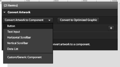
Button components have four states:
Buttons for each of these states appear within the HUD whenever one of your buttons has been selected. We can edit each of the states’ graphics individually by clicking on them.

Double-click on the button with the blue arrow graphic to select it, and copy the button. Use the breadcrumb at the top of the Design area to switch out of the button, and then double-click one of the other two buttons. Go to the Over state, delete the graphic that’s there, then paste the blue arrow in its place. To align it precisely, look at the Properties panel and set the X and Y values to 0. You should now find that the arrow is positioned perfectly.
Something missing? The text in that state will most likely have disappeared, because the blue arrow will have been placed into a new layer above the text. To make it reappear, simply go to the Layers panel and grab and drag the text layer and drop it above the new graphic layer. This text will also need a change of font color.
Currently, Catalyst’s ability to edit graphics is quite limited. We’re able to modify this label’s size and opacity, but to change other attributes like color or font, we need to return to Illustrator. To do that, right click on the text object and choose Edit in Adobe Illustrator CS4.. You can do this either in the design area, or within the Layers palette.

This will launch the artwork in Illustrator – only the text will be editable‚ and the remaining content will be disabled. You’ll also see a bold yellow message above the Illustrator artboard, telling you to save and close the window when you’re finished.
In Illustrator, change the font colour to white and save. Illustrator will prompt you to save with FXG options‚ FXG is the new language that Catalyst uses to exchange graphics between itself and Adobe design tools like Illustrator and Photoshop. Accept the defaults and close the file in Illustrator, and then switch back to Catalyst. There’ll be a dialog asking you whether you want to accept the Illustrator changes. Accept them, and you’ll see the text with its new colour.
Repeat that process for the button’s Down state. You’ll need to copy a grey background from one of the other two buttons to use for the Up and Disabled states in the Popular Artists button as it had the blue arrow graphic when we created it. You’ll also need to change the colour of the font for this button in Illustrator to black for the Up and Disabled states‚ so let’s do that now.
Back in part one, we created a Data List component for the list of tracks. The repeated item in the Data List features some interactivity that may not be apparent until testing‚ you can do this by choosing File > Run Project. In your browser, you’ll see the application appear in a new tab or window. You should notice that when you roll over or click on an item, the items reveal a subtle light blue background: we’re going to adjust the background colour to be a bit brighter.
Double-click on the repeated item component to open it, and you’ll see the three states that represent different interactions‚ normal, hovered, and selected. Managing the appearance of the way the item changes across states is relatively easy; we simply edit the appearance of the object in each state, much as we did for buttons.
First, we’ll modify the colour of the background in the Hovered state. Right click on the background image and choose Edit in Adobe Illustrator CS4.. Change the fill colour of the graphic to a shade to your liking. Save the changes in Illustrator and switch back to Catalyst, accepting the change it asks for. You’ll see that the background colour of the Hovered state has been updated. We can do the same for the Selected state.
The music chart up/down arrow needs states too; we’ll show an up or down arrow to show how the track has changed chart position lately. Since none of the pre-set component types in Catalyst will be able to help us with this task, we’ll need to convert the arrow into a custom component. Select the arrow and select Custom/Generic Component from the Convert Artwork list. Then, choose Duplicate State from the top left of the screen‚ it’s a small button just below the Pages/State list. At the top right of Catalyst is a toolbar: clicking the last one, Transform, will let you rotate the arrow to point down. Double-clicking on the name of a state will allow you to rename it. Here, I’ve named the states trackUp and trackDown, respectively.

The list will look a little empty until the user has selected a music chart to display. We’re going to set the application to start with the list hidden, only displaying it once the data has been fetched from Yahoo. We’re going to use two application states to achieve this effect.
Duplicate the current state and rename it to defaultState, then name the second one chartState. Select the Data List in defaultState and delete it: you’ll see that the list is still in the second state when you switch between the two.
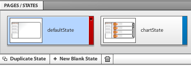
When a user presses one of the chart buttons on the left, we’d like to show the chartState. To make this happen, we’ll choose one of the buttons in the first state and select the plus button to the right of Custom Interactions in the HUD. Choose On Click from the list. From On Click Interactions choose Play transition to state and choose chartState from the list. For the user, clicking on the button will make the list appear. Later, we’ll add code to that button in Flash Builder to call a Yahoo YQL query to fetch the data to display in the list.


Repeat the process for each of the buttons. With the interactions added you should see that each object has a Fade transition effect added to the Timeline below the design view. The switch between states’ actions can be animated with that Fade effect. Sliding the effect in the Timeline to control it is quite intuitive: simply grab it and move it. You’re now ready to test the interactions. Choose File > Run Project to run the application again, and click on the buttons to see the change between states. Adjust the interaction changes in the Timeline to taste.
We’re going to add one more state to the application to serve as a detail view for the repeated items: this will use the artwork from the detailed view we created all the way back in part one. The additional panel will behave like a pop up to display other releases for a selected artist.
Start by duplicating chartState – call the new state artistDetailState. The design has a pop over panel to display the new information. We’re going to dim the current content for this state as the detail panel appears. Do this by selecting all the items in the state except the background graphic, and set their opacity to 40 in the properties panel.
If you look carefully at the Layers palette you’ll see a layer called Overlay. This contains all the objects that will be shown in the detail state. When we do this, we’ll make the repeated item a button. Go back to chartState and enter the Data List component by double-clicking on it, then open the repeated item by double-clicking again, and select its background. Convert the background into a button using the HUD and set its On Click event to play to artistDetailState. The Fade effect in the Timeline will do a really nice job of transitioning the opacity later on if you choose to use it. The detail view has repeated data in its design. Later, we’ll convert this to a component in Flash Builder. For now, delete the text, leaving the title text as is.
Oops‚ I’ve just realised we forgot to provide a way of closing the panel in the artwork! This is a great excuse to show you how to create a new button from scratch in Catalyst.
To do it, draw a circle with the Ellipse tool found in the toolbar at the top right of Catalyst‚ it looks like a circle itself. Add a letter X with the Text tool to the center of the circle and select the two, converting them to a button from the HUD‚ feel free to edit the button to have other graphics in the other states if required. Add an On Click interaction to the new button and set it to switch back to chartState to close the panel.
With all of the interactions the way we want them, we’re almost ready to complete the project in Flash Builder! This is a great time to double-check that you’ve saved your work.
While we’ve been working on our project, Catalyst has been building a number of MXML files that Flash Builder can compile to Flash. It’s possible to view that code right here in Catalyst by switching from Design to Code view‚ do this by using the pull-down menu at the top right in Catalyst. Save the Catalyst project and then launch Flash Builder.
In Flash Builder, you can create a project from an FXP file by selecting File > Import Flex Project (FXP). Using the navigator on the left, locate the project’s root file at src > (default package) > Main.mxml. You’ll see that there is a fx:Script block at the top of the code that contains functions for each of the three buttons that you created in Flash Catalyst. Also, note the s:transitions tag pair, which contains any transition effects you may have added via the Timeline in Catalyst. Below that the states are defined in the s:states tag pair. Finally, you should see buttons and other visual elements, all of which have been assigned instance names that we can access from ActionScript.
We’re going to be calling a Yahoo service called YQL to fill our application with data. It’s a language that you can use to query data from web services. You will need to have a developer account with Yahoo to build and test with YQL: more details can be found at the Yahoo developers’ site. YQL queries are simply URLs with your query attached as a string at the end. You can choose to have the results returned as either XML or JSON using an additional variable at the end of the URL to indicate the return type‚ &format=xml or &format=json, respectively.
The Flex HTTPService component is used to call a remote HTTP service. We need to add one HTTPService for each YQL call, and both these tags need to be nested in a pair of fx:Declarations tags.
Below is an example of a HTTPService call to a YQL service to retrieve the most popular music tracks. The URL value of the tag is the YQL query. The tag’s result attribute indicates what function to use once the query result is received. Flash Builder will prompt to create the outline of a function for you if you add that attribute, which is what we’ve chosen to do here. The resultFormat attribute is used to indicate how the result’s data will be typed. To provide feedback to the user, we’ve also used the showBusyCursor attribute to change the cursor while the data is being fetched.
<s:HTTPService id="trackPopularService"

  url="http://query.yahooapis.com/v1/public/yql?

  q=select%20*%20from%20music.track.popular"

  result="releasePopularService_resultHandler(event)"

  resultFormat="xml" showBusyCursor="true"/>
These services will be called by clicking on one of the buttons that we created in Flash Catalyst. There’s a click handler function for each button already in the fx:Script block at the top of the code. These click handlers were created in order of button creation by Catalyst – you may need to run the application later to double check that the names match the positions. Here’s an example of one of these button click handlers: we’ve added a second line to it to call the URL of the HTTPService discussed above.
protected function Button_click():void

  {

    currentState='chartState';

    trackPopularService.send();

  }
The function that will be called once the result has been received has a ResultEvent parameter, which in turn has a result property. This is where we’ll find the XML data that we need to populate the Data List. Flex data components have a dataProvider property that typically has an ArrayCollection assigned as its value. This is a wrapper class that exposes an array as a collection, but essentially is an array of objects that has additional methods and properties. We’ve already defined a variable typed as ArrayCollection called chartData in the script block and made that bindable so that any component using that variable as a dataProvider will update if the ArrayCollection changes. Here’s that variable:
[Bindable] private var chartData:ArrayCollection = new ArrayCollection();The function for the result of the first HTTPService call is listed below. You’ll notice that we reset the chartData ArrayCollection by re-initializing it. We then create an XML variable out of the event’s result property, then loop over the XML to parse it. With each iteration of the loop we create an object called dataObj and add properties to it which are equal to specific values in the XML. The last thing that we do in the loop is use the ArrayCollection‘s addItem method to add dataObj to it.
protected function releasePopularService_resultHandler(event:ResultEvent):void

  {

    chartData = new ArrayCollection();

    var resultsXML:XML = XML(event.result);

    var tracksXMLList:XMLList = resultsXML.child("results").children();

    var len:Number = tracksXMLList.length();

    for ( var i:Number = 0;i<len;i++) {

      var dataObj:Object = new Object();

      dataObj.track = tracksXMLList[i].attribute("title");

      dataObj.artist = tracksXMLList[i].child("Artist").attribute("name");

      dataObj.artistID = tracksXMLList[i].child("Artist").attribute("id");

      dataObj.chartNow = tracksXMLList[i].child("ItemInfo").child("ChartPosition").attribute("this");

      dataObj.chartPrevious = tracksXMLList[i].child("ItemInfo").child("ChartPosition").attribute("last");

      chartData.addItem(dataObj);

    }

}The Data List we created in Catalyst is used as the skin for a Flex List component. That’s located in the code below the three buttons, which you’ll see in the following example. Catalyst has manually added values to populate the list by nesting an ArrayCollection. You’ll see that the dataProvider attribute is there, but has an empty string value. We’re going to delete that ArrayCollection and bind the dataProvider attribute to our chartData ArrayCollection. Below, you’ll notice I’ve used a pair of curly brackets, this will repopulate the list if the value of chartData changes.
<s:List x="200" y="89" skinClass="components.DataList1" id="list1" includeIn="artistDetailState,chartState" alpha.artistDetailState="0.4" dataProvider="{chartData}"/>The repeated item that we built in Catalyst is now a component in the Flex project. It’s stored in a file, RepeatedItem1.mxml, which can be found in the components folder of the project. Open it and you’ll see RichText components that we’ll need to populate with data from the List’s dataProvider. You should see that the text attribute of each of the RichText components is already bound to a property of an object called data‚ this is the collective name given to the values passed by the List component the current row as it loops over the dataProvider. We need to update the text attribute of each of these RichText tags to equal the data we’ve received.
The example code below is one of the RichText components from RepeatedItem1.mxml. Look at the text attribute of this tag and you’ll see that its value is bound using curly brackets‚ this means it will update to the current value assigned, which in this case is data.chartNow. The chartNow value is in the chartData ArrayCollection that we populated with the function detailed above. It’s one of the properties of the dataObj object that we built and populated while we looped over the XML data received from the YQL service call. Check the other RichText tags and you’ll see that we’ve also updated ours to equal other properties in the data from the ArrayCollection.
<s:RichText width="38" height="54"

  textAlign="center" fontFamily="Helvetica"

  fontSize="30" lineHeight="120%" color="0xffffff"

  whiteSpaceCollapse="preserve" kerning="on"

  ai:knockout="0" d:userLabel="5" text="{data.chartNow}"

  x="14" id="richtext1" y="18"></s:RichText>
We’ve added a function to the fx:Script block of RepeatedItem1.mxml to change the display of the chart arrow to either up, down or hidden based on music chart movement. It’s using the chartNow and chartPrevious values from the same data we used to populate the RichText tags. The function is controlling the chart arrow component, which in this case will have a name like customcomponent11. That function is called each time we render a row by using the opening tag’s render event. You’ll find that in the first line of code in RepeatedItem1.mxml in our sample version. The function is detailed below:
private function chartPosIndicator():void {

  if (data.chartPrevious == "0" ) {

    customcomponent11.visible = false;

    richtext2.text = "new";

  } else if ( Number(data.chartNow) < Number(data.chartPrevious) ) {

    customcomponent11.currentState = 'trackUp';

  } else if ( data.chartNow == data.chartPrevious ) {

    customcomponent11.visible = false;

    richtext2.text = "";

  } else if ( Number(data.chartNow) > Number(data.chartPrevious) ) {

    customcomponent11.currentState = 'trackDown';

  }

}
The other function in RepeatedItem1.mxml calls a public method in the parent file, Main.mxml, passing the artistID and artist values for the current row.
protected function Button_click():void

{

  mx.core.FlexGlobals.topLevelApplication.showArtistReleases(data.artistID,data.artist);

}
This function in turn assigns the values received to local variables already created, calls the send method of the last HTTPService, and changes the state of the application to artistDetailState.
public function showArtistReleases(selectedArtistID:Number,selectedArtistName:String):void {

  artistID = selectedArtistID;

  artistName = selectedArtistName;

  releaseArtistService.send();

  currentState='artistDetailState';

}
The fourth HTTPService call uses a parameter to retrieve releases for a specific artist. We need to use the data from the row that the user clicks on to make that work, which is why we’re using the two functions listed above. The first calls the second from within RepeatedItem1.mxml, passing the artistID needed as a parameter for the HTTPService call. Within the second function, we’re assigning that artistID to a local variable that we’re using within the url attribute of the last HTTPService call. Below is that URL, and if you look towards the end of the value you’ll see {artistID}, which is a binding to the variable.
url="http://query.yahooapis.com/v1/public/yql?q=select%20*%20from%20music.release.artist%20where%20id%3D%22{artistID}%22"The result handler function for that service call is similar to the other result functions. Instead of the chartData ArrayCollection, we’re populating another ArrayCollection called otherReleasesArtist. This is used to populate a DataGrid component that we’ve added to the details panel we build as part of this article. The panel can be found in the components directory as CustomComponent2.mxml. We’ve added an ArrayCollection to this component and used it as the dataProvider for the DataGrid, setting the ArrayCollection as public so that we can change its value from Main.mxml – this is set in the last line of the result handler listed below. We’re also setting the title of the panel to the artistName variable passed when RepeatedItem1.mxml was clicked.
protected function releaseArtistService_resultHandler(event:ResultEvent):void

{

  otherReleasesArtist = new ArrayCollection();

  var resultsXML:XML = XML(event.result);

  var tracksXMLList:XMLList = resultsXML.child("results").children();

  var len:Number = tracksXMLList.length();

  for ( var i:Number = 0;i<len;i++) {

    var dataObj:Object = new Object();

    dataObj.releaseTitle = tracksXMLList[i].attribute("title");

    dataObj.releaseYear = tracksXMLList[i].attribute("releaseYear");;

    otherReleasesArtist.addItem(dataObj);

  }

  customcomponent21.artistName = artistName;

  customcomponent21.otherReleasesData = otherReleasesArtist;

}
And that should be it! Save your work, and test your application by pressing the Run button at the top of Flash Builder. If all went well, chart data should start flowing into the completed application.
You can view my completed app here, and if you’re interested in viewing the complete source of my project, you can download my Flash Builder project here.

Through both parts of this article we have demonstrated how to design a Flash application interface using Illustrator, and then convert the resulting Illustrator file into interactive Flash content using Flash Catalyst. Designers can now easily translate their design skills into interactive user interfaces and add functionality using Flash Builder. So, congratulations – you’ve just created a Flash masterpiece!
Why not test your knowledge of this article with our quiz?
via Comments on:
Flash Catalyst, formerly codenamed Thermo, promises to make the process of converting an interface design to code a smooth and easy experience. In this tutorial, spread over two parts, Andrew Muller shows us how to build a nifty Flash application that retrieves music chart data from Yahoo!, using Illustrator, Flash Catalyst, and Flash Builder. Pay attention – there’s a quiz at the end!
Note: To play along at home, you’ll need to grab the following:
Designers have a variety of tools they use on a regular basis to do their day job, often sticking to the one that they know best. Adobe’s Illustrator and Photoshop are two that dominate the software list of choice for interface designers of all stripes, whether they’re involved with site design, rich internet application (RIA) development, or any other kind of screen-based experience. Then, the design is handed over to a developer to convert into a working interface.
A shortcoming of this design process is that, while it allows the designer to create a look for a web application, it’s impossible to see the feel or interactivity of an application until a developer has implemented it. The translation of that design is often imperfect, with designer and developer sometimes at odds over an object being a pixel out or the wrong color shade. How can we build stronger bridges between the two? Enter Flash Catalyst.
Adobe has recently released the first public beta of Flash Catalyst, a new tool to help designers become more involved in the process of building RIA interactions. Designers can use Catalyst to build interactive interfaces for the Flash Player from work they’ve created in either Illustrator or Photoshop, with support for Fireworks slated to follow in a later release. Catalyst is capable of maintaining virtually all the characteristics of the original artwork; users can create interfaces in the applications with which they’re most comfortable, import them to Catalyst for more changes, then complete the round-trip back to the original design tool for further design alterations. Of course, since Catalyst is still in beta, there are some missing options that should come in later beta releases, but it still will give the user a good feel for what’s to come.
As well as converting artwork into a Flash interface, Catalyst includes tools to add interactive elements to the design. This initial release has the ability to convert objects into a limited but useful number of UI components, including data lists, buttons, and scrollbars, with extra UI controls available for wireframing interfaces directly in the Catalyst design view. Catalyst also includes tools for managing state and animated effects. Developers are likely to enjoy Catalyst because the designer can now turn objects into buttons before handing over the design, thus reducing a developer’s workload. It will also mean that there should be less possibility of designs being improperly applied to Flash applications, since all the visuals have been prepared in advance.
We’re going to create a simple Flash application that will display information retrieved online via Yahoo’s YQL (Yahoo Query Language) service. For dynamic content we’ll use four YQL queries to retrieve a variety of music chart information. To help make this tutorial easier, we’ve decided to use example queries from the YQL site. Yahoo also provides design stencils that you can use to prototype your next RIA masterpiece; the tab stencils from the Yahoo design kit were part of the inspiration for the design of this application.
To begin, I’ve taken a vertical tab design out of the Yahoo stencil kit and imported that into Illustrator. The next task is to create the outline shape of the application – in this example I’ve used Illustrator’s drawing tools to design a box for that, with two rounded corners and a gradient fill to lift it up a bit. The app we’re building will be retrieving multiple rows of data from the YQL service as XML, so the next job is to define a way to display that repetitive data. Depending on the type of data, the typical interface pattern is to display information in either rows or tiles – here I’ve used rows.
We’ll then need to create artwork to represent a single row of music chart data. The data that we’ll receive could include chart position, a URL for album cover artwork, a chart position shift indicator, and the names of the artist and track. Lastly, there’s a scrollbar, designed to match the curvy corners of the application.
Next, we’ll need to create artwork to represent the detail view state for the application. In Catalyst, we’re able to specify different states using different files or different layers within the file. Catalyst also has a simple timeline, which may be used to control the timing of objects fading in and out as we switch between states.
With that done we’re ready to show the mockups to a client for feedback, finalize the design, and bring it into Catalyst for some interactivity! Here’s the mockup displaying both states of our app.
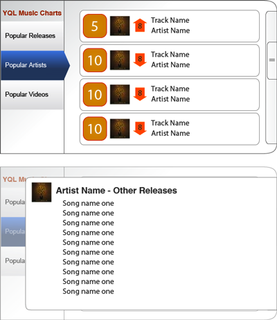
Next, it’s time to start adding interactivity in Catalyst.
Time to jump into Catalyst! Use the option to create a new project from an existing design file, and open the Illustrator file that we’ve created. It’ll take a moment or two to parse the file – naturally you should pay attention to the prompts for options like canvas size and editable regions, but in this example we’ll leave everything set at default.
Let’s begin with the track/artist chart display part of the design. We’ll convert this into a predefined Catalyst component called a Data List. Select any object in the design, and you’ll see a floating gray panel called the Heads Up Display (HUD) appear. This is used to create and manage interactive components.
The column of options on the right of the screen contains a series of panels that may be familiar if you’ve used Flash previously. In here you’ll find layers, library panels, and property panels as you normally would in Flash to manage various aspects of your content. As in Flash, the higher an object is in the Layers panel, the closer it is to the top of the stack of objects – that’s an important point to remember. The Layers panel is also a good way of quickly selecting specific objects, especially if they’re small or otherwise difficult to click on.
The list is made up of repeated items with a scrollbar to move through the content. We’ll start by converting the scrollbar art into a working scrollbar. Select the elements that make up the scrollbar design. In our slider, we have a track, a thumb, and three small lines representing the thumb’s grip; we’ll select all these, and choose Convert Artwork to Component > Vertical Scrollbar from the HUD. You might find that it’s easier to grab the items from the Layers panel, especially when they’re quite small, like the tiny texture on our scrollbar.
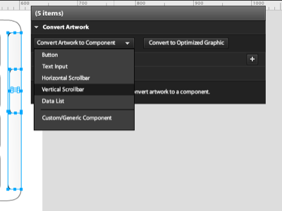
Once converted, you should see a small yellow message in the HUD indicating that there are some component issues: this is because we still need to identify the individual parts that make up our scrollbar. Choose Edit Parts from the HUD, and select the track, then define it as the scrollbar’s Track from the Convert Artwork drop-down. Select the thumb image and the gripper artwork, and set them as the Thumb part from the same set of options.
Now that we’re finished with the scrollbar, we’ll need to return to the main Design window to continue building the application. There’s a breadcrumb-like indicator at the top left of the design area listing which part of the application you’re in; click on the first item in the breadcrumb to return to the whole application.
The next component that we’ll use within the design is the repeated list item, representing how each row of information will look within our Data List. We’ll only need one of the rows that we created for the mockup, as this is all Catalyst requires to determine how the items should look, so we’ll delete the bottom three and just keep the first one. Then select all the graphics for that first row, plus the scrollbar component that we’ve just created, and use the HUD to convert the artwork to a Data List component.
Once again, a yellow message appears to indicate that there’s an issue with the component – we need to identify what element will form the repeated item. Select the artwork for the whole row, click Edit Parts, and define the row with the HUD to a Repeated Item. You should see that item will repeat down the window.
The size of the Data List affects what’s currently displayed, including the way that content will be cropped as you scroll up and down later on, so now’s the time to adjust the size of the data list to taste. Using the breadcrumbs above, double-check to see that you’re still within the Data List component, then use the drag handles to adjust the height of the list accordingly. We’ll extend the height of the Data List component to just inside the application itself; that way the list will appear to be masked by the application when it’s in use.
Let’s see how that looks. From the File menu, select Run Project. Flex will begin building your application, and a new browser window will appear. If all went well, you should find that you can scroll up and down the Data List using your scrollbar.
The next step in our application is to start adding the interactions to the design – but you’ll have to stay tuned for the next part of this tutorial for that! In Part II, we’ll add more interaction, show you how to take your Catalyst project into Flash Builder, and populate the application using queries generated via Yahoo’s YQL service.
For now, save your project, and relax – we’ll see you in Part II!
Think you have what it takes to be a Flash Catalyst guru? Prove it with our quick quiz!
via Comments on:
The Flash that you thought you knew has changed. It’s grown up.
In this article, I’ll explain some of the technologies that make up the Flash Platform, how they fit together, and how you can use them to build RIAs. Pay attention, because there will be a quiz at the end! The first 200 people to submit their answers will receive a copy of The Adobe Flash Platform ActionScript Reference for Rich Internet Application Development (that’s the print version) delivered to their door for free, thanks to Adobe.
The transformation that Flash has undergone has been occurring for some time, and many developers are aware of it. Every day I hear of a developer building a powerful new application for the Flash runtime that performs tasks like connecting to enterprise solutions powered by SAP or Oracle – and all with the full blessing of those vendors. Flash has evolved beyond the Skip Intro button for which we used to hate it, and has become ubiquitous – helping the browser perform way beyond the text rendering that it was first built for.
It was Macromedia (back in 2002, in their pre-Adobe acquisition days) who coined the term Rich Internet Application (RIA). The introduction of this term coincided with the release of a set of new custom components for Flash MX, thus supplying Flash developers with a set of UI components and providing them with a means to build their own. Flash already contained the ability to make a call to a remote server without forcing a page refresh, but with the release of ColdFusion MX that same year came Flash Remoting, which allowed applications built with Flash to pass serialized data to the server via AMF (Action Message Format).
These two products – custom components for Flash and Flash Remoting – and the synergy that could be experienced by combining them has since been expanded many times in the six-and-a-half years since they were first released. Recently, these technologies have been termed the Adobe Flash Platform. This umbrella term describes a collection of Adobe products, including multiple runtimes, development tools, and servers.

The Flash Player is the cornerstone of the Adobe Flash Platform; it offers the developer a single, cross-platform runtime with all the capabilities of the Internet today. It supports more than just vector animation – it’s also a multimedia player. In fact, the majority of all online video today is delivered via Flash, with the capacity to offer true High Definition video via the same H.264 codec used in Blu-ray.
The runtime can communicate with application servers via web services, HTTP, and remote object calls without the need to perform a browser refresh. Additionally, the player has had VoIP capacity for many generations, and it’s possible to build and deploy collaborative applications with Flash that can include text chat, whiteboarding, and the sharing of desktops across operating systems.
A lot of effort has been invested into making sure that Flash-based RIAs work successfully for the wide variety of devices and operating systems. For example, Adobe and Google together have recently announced the successful implementation and development of a virtual user that Google uses to retrieve text from Flash content; this enables the content to appear in Google’s search results. Adobe is constantly improving the performance of accessibility within the Flash Player and its compatibility with screen readers for the visually impaired. Deep linking and browser history compatibility are features present in the open source Flex framework for Flash applications; these aim to eliminate the kind of navigation problems encountered with dynamic content in Ajax-based RIAs.
Adobe has successfully matured the Flash runtime in the short time that they’ve had it as a product. With each iteration, particularly Players 9 and 10, significant improvements in performance have occurred; Player 10 now offers hardware acceleration for advanced graphical effects. Flash Player 10 also introduces new functionality, including 3D effects, custom filters and effects, advanced text support, and dynamic streaming for improved video performance.
Flash Player 10 is the latest version of the browser plugin; it’s available for Windows, OS X, Linux, and Solaris. Flash Lite 3 is a scaled-down version of the runtime for use on mobile and handheld devices.
And then there’s Adobe AIR – a new category of runtime that combines Flash Player 10 and WebKit (the web page rendering engine behind Safari and Chrome) into a stand-alone runtime capable of running offline applications. The runtime is available for Windows, OS X, and Linux.
Adobe AIR was introduced by Adobe mid-2008 after a lengthy public beta cycle. Developers can use their web application building skills to create apps for the desktop and deploy them via AIR. The AIR runtime incorporates functionality missing from the browser, such as access to the file system to create, delete, and maintain files and folders.
Adobe AIR supports drag and drop interaction with the operating system, network connection detection, and SQLite for local storage of data; the latter can be easily searched with standard SQL queries. If Acrobat Reader is installed on the client machine, AIR will utilize that software package’s capabilities for rendering PDFs. A version of the AIR runtime for mobile and handheld devices has been hinted at by Adobe, although there’s yet to be a release date announced.
Of course, all of these tools are free to download, and Flash Player is bundled as part of a Windows and OS X distribution.
Flash CS4 Professional is the latest iteration of the Flash authoring environment. Originally an animation tool, the Flash IDE can also be used to program Flash movies using ActionScript, an ECMAScript-based object oriented programming language. It has the necessary tools for ActionScript authoring, including an ActionScript editor and an advanced debugger. Flash CS4 is both a tool for designers and developers, and while it’s possible to create whole applications with Flash, Adobe has created a framework for Flash applications called Flex (check out some of the Flex tutorials on sitepoint.com).
Originally released as an enterprise platform (with an enterprise price to match), Flex is now a free, open source framework for building applications to run within the Flash runtime. Flex applications are authored in a combination of two languages:
MXML, a declarative XML-based language in which tags represent classes within the framework; it’s principally used for UI layouts and behaviors, and ActionScript 3, an object-oriented language typically used for client logic. Developers with a Java background will find ActionScript intuitive and may be tempted to author with it entirely.
The Flex framework contains over 100 extensible UI components. It can be downloaded for free as part of the free Flex 3 SDK, which also contains a stand-alone compiler.

A number of open source frameworks have emerged to assist Flex application development. The most popular of these is Cairngorm, an open source project managed by Adobe. Others worth looking at include Mate, a tag-based, event-driven framework; and PureMVC, a lightweight ActionScript 3 framework for creating applications based on the model-view-controller concept.
While the Flex framework and Flex SDK are free, the Flex development tool, Flex Builder, is a commercial product (although it’s free for educational use). Flex Builder 3 is an Eclipse-based IDE, and is available as either a stand-alone application or as a plugin for Eclipse. There are versions of Flex Builder for both Windows and OS X, and a beta version is available for Linux.
Flex Builder supports the editing of MXML, ActionScript, and CSS files, including code completion, tag insight, and syntax coloring. It also includes a visual layout tool, to facilitate the positioning of components in a WYSIWYG environment.
Flex Builder is available in two editions, Standard and Professional. The Professional edition includes a charting library, performance profiling tools, and support for automated functional testing. Projects built with Flex Builder can be deployed either in the browser via the Flash Player, or as stand-alone applications via Adobe AIR.
A Flash application is able to retrieve data from a remote server via HTTP calls; this can be done with either of the Adobe tools mentioned above. With Flash MX, Macromedia introduced a once proprietary binary data transfer format for communication with an application server called Action Message Format (AMF); this has recently been made open source. AMF borrowed the means to describe the structure of data from the SOAP protocol; automatic translation of this format was provided with the Flash Remoting classes and service that was included in ColdFusion. AMF has also been reverse-engineered and is available for a number of application servers; AMFPHP, WebORB, and RubyAMF are examples of that reverse-engineering.
Adobe now also have an open source, Java remoting and web messaging technology that Flex and Adobe AIR applications can use to connect to Java server logic called BlazeDS. This uses the same AMF protocol mentioned above. BlazeDS integration has recently been added to the Spring framework to make Spring-powered RIAs with Flex front ends possible.
Adobe have additional server products that also support AMF; ColdFusion has been previously mentioned, while another is LiveCycle Data Services, which also includes Flex Messaging for real-time data push and publish/subscribe messaging.
The Adobe Flash Media Server group of products are also included within the Flash Platform. The Flash Media Interactive Server can be used to build Flash-based collaborative applications, which can include features like streaming Flash video, VoIP, chat, webcam chat, and online gaming. The Flash Streaming Media Server is capable of streaming both live and on-demand Flash video.
Adobe’s long-awaited technology preview, Thermo, was released to attendees at Adobe MAX in November 2008 under the new name, Flash Catalyst. This is an interaction design tool for RIAs that will be released as a public beta in the first half of this year. Flash Catalyst will import design comps created in Illustrator, Photoshop, or Fireworks, making use of a new interchange format introduced with all the CS4 design tools called FXG.
Flash Catalyst can convert the design elements in the artwork into design and interactive elements for an RIA project with workflow; this gives it the ability for an interactive element like a scrollbar to go back to Illustrator for some design tweaks to occur. Flash Catalyst converts elements like buttons or scrollbars into Flex custom components. Interactions and timeline events are added visually to projects in Flash Catalyst, but in reality the application is creating the whole project as MXML. Under the hood, Flash Catalyst is another Eclipse-based application just like Flex Builder.
Flash Catalyst is already listed as a part of the Flash Platform; the MXML that it produces is incompatible with Flex 3, but will be compatible with the next version, Flex 4 (code-named Gumbo), which is in public beta. Flex 4 has graphical enhancements including an implementation of FXG, and customizable components.

Another new project related to Flash that was released at Adobe’s annual developer conference MAX late last year was Alchemy; this is a research project that allows users to compile C and C++ code to run on Flash Player 10. There were quite a few good examples of how additional functionality could be added to Flash-based applications using existing libraries, including encryption, support for RAW digital photographs, and PDF creation.
Adobe’s Flash Platform offers the RIA developer a powerful, ubiquitous runtime in the Flash Player; within the browser it’s a case of code once, deploy everywhere, as there’s a version of the runtime for all major operating systems. The Flex open source framework gives developers the ability to build rich interactive applications to run in both the browser and on the desktop via Adobe AIR; it provides the ability to connect to data through a number of different connection types.
If you’re building a Rich Internet Application, and haven’t checked out the technologies that comprise the Adobe Flash Platform, then now is a good time to start. We’ll be publishing more articles on these topics over the coming months on sitepoint.com, so stay tuned!
In the mean time, test yourself on the contents of this article by taking the quiz. The first 200 people to submit their answers will receive a print copy of The Adobe Flash Platform ActionScript Reference for Rich Internet Application Development, delivered to their door for free, courtesy of Adobe. Take the quiz now!
via Comments on: